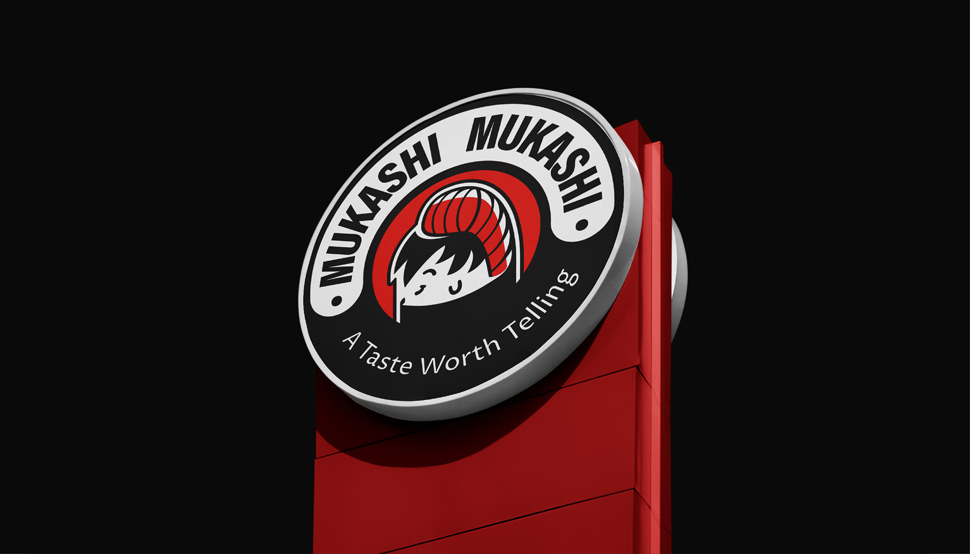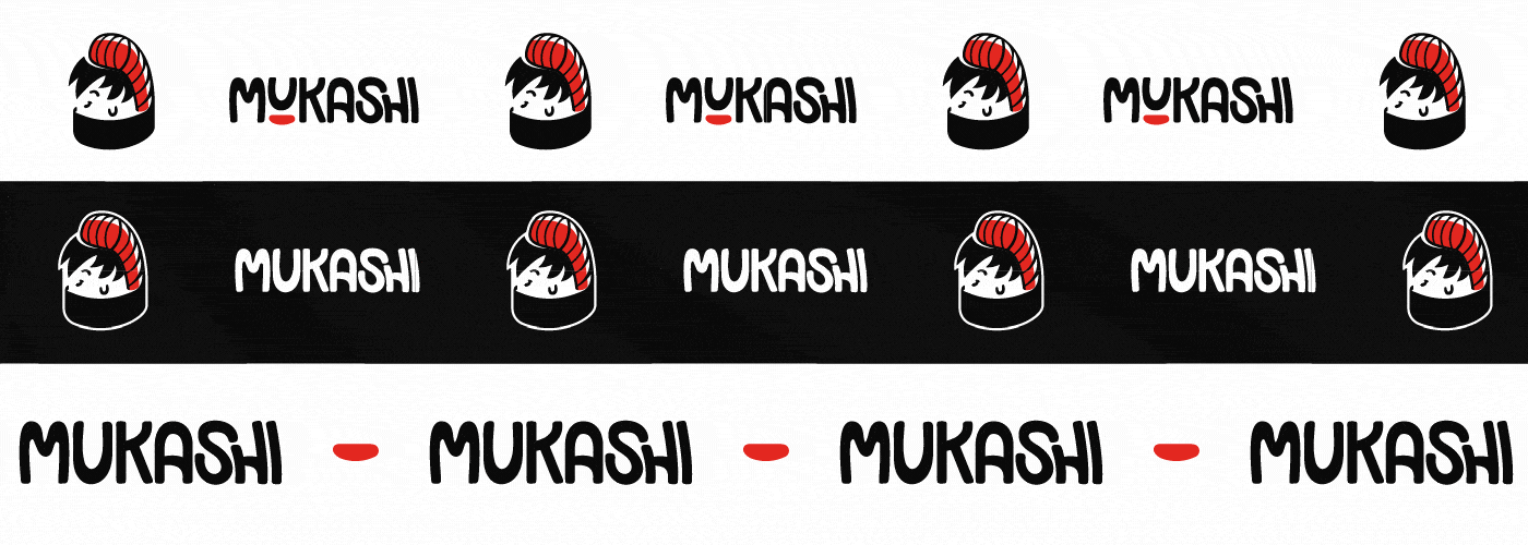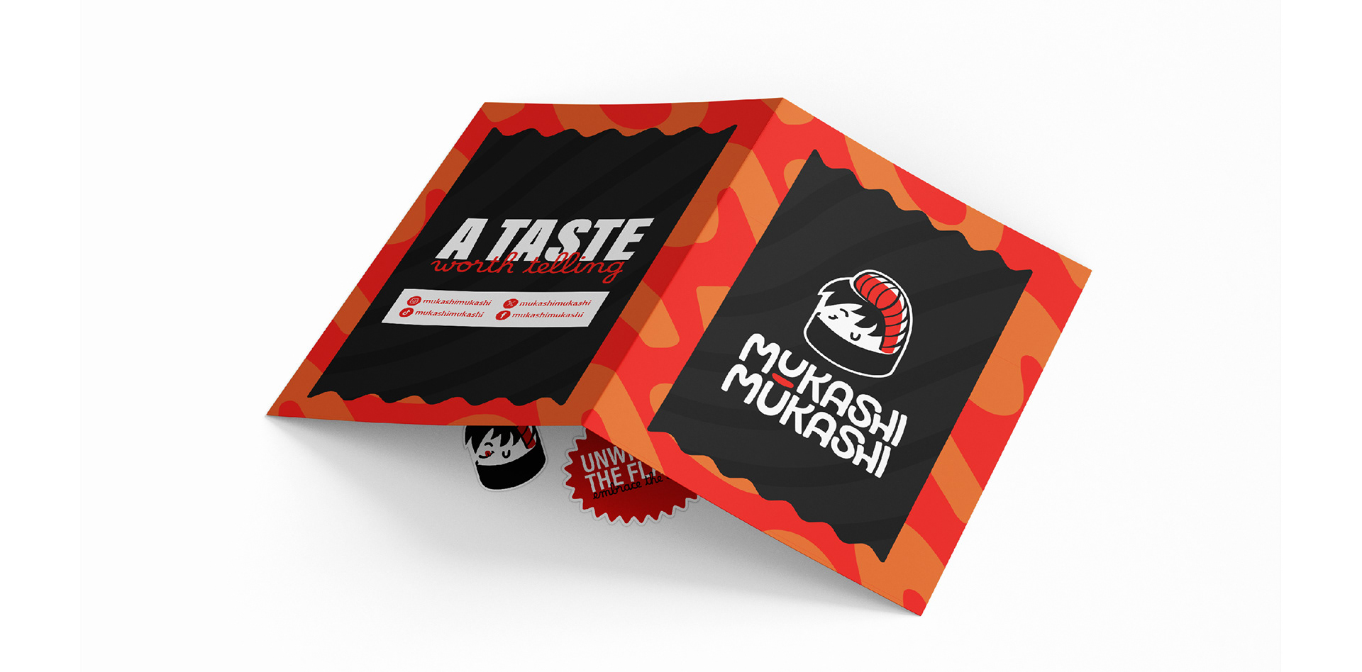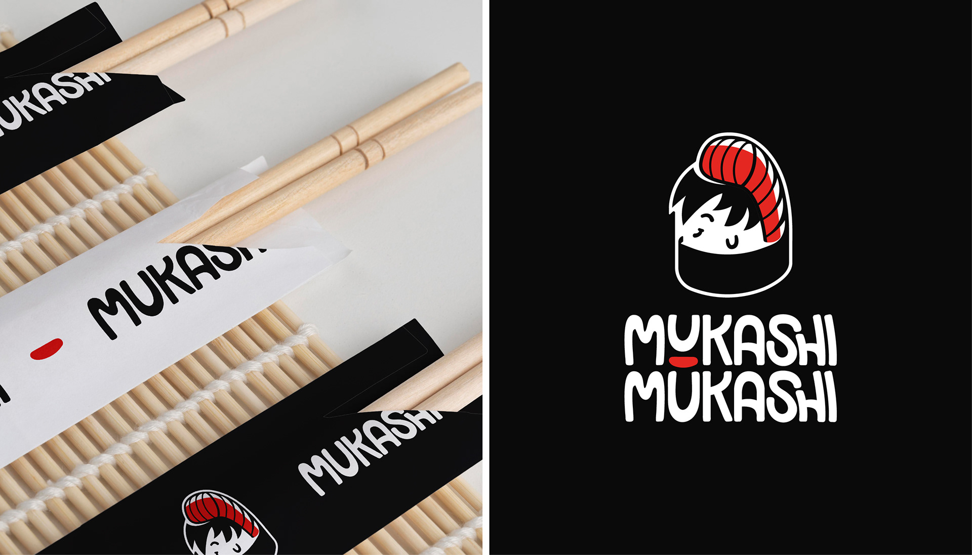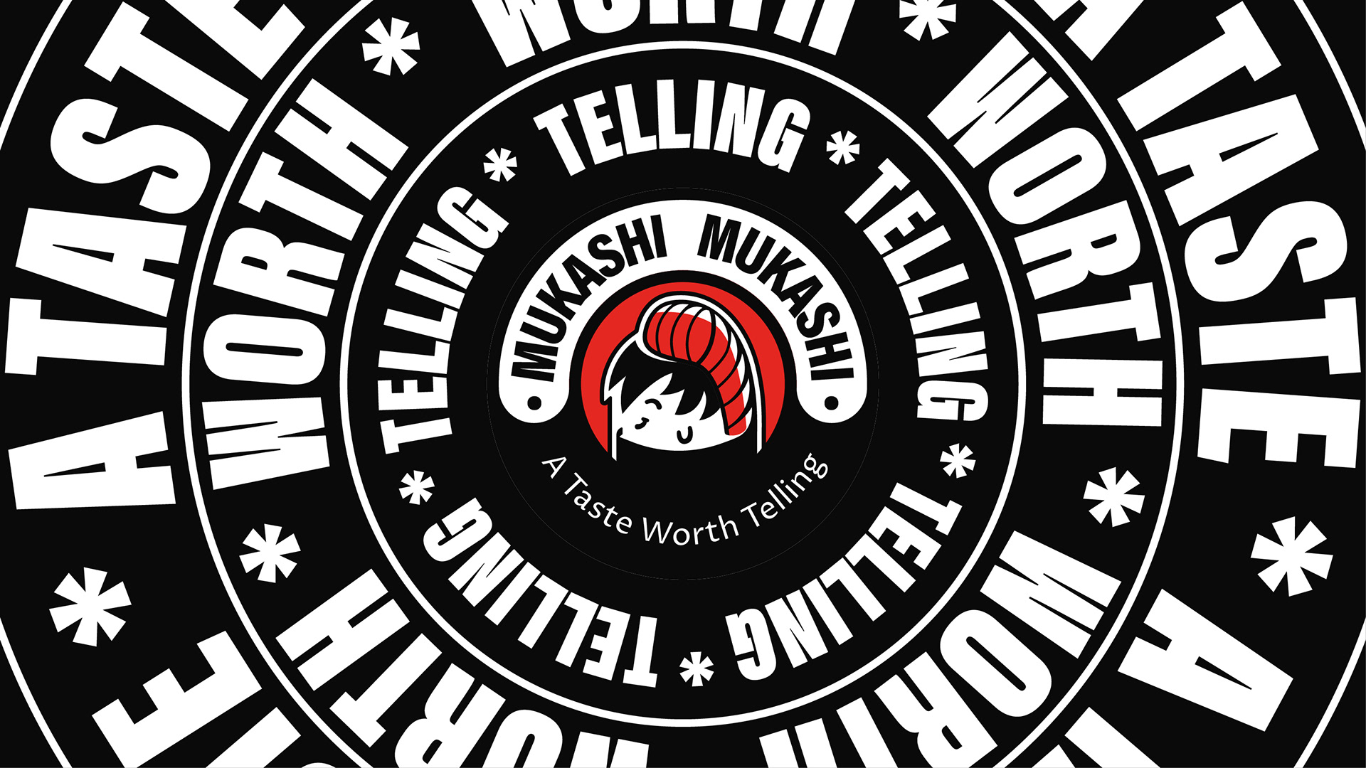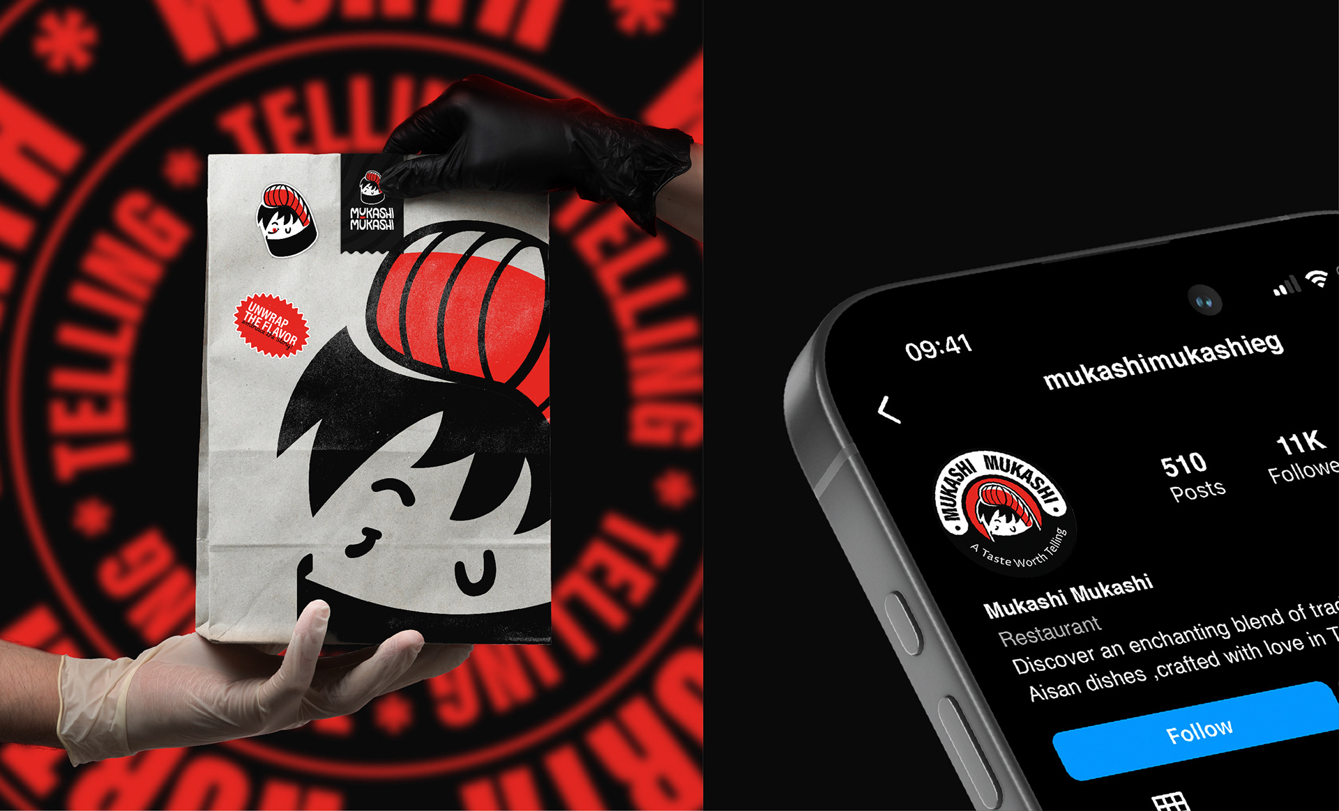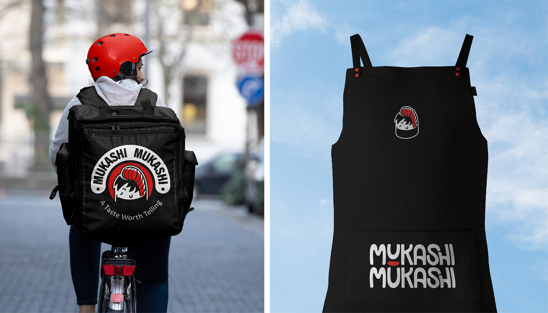
Mukashi Mukashi 昔 昔 - A taste worth telling
I’m thrilled to introduce the visual identity crafted for Mukashi Mukashi, an exciting new sushi restaurant that reimagines the traditional sushi experience. The goal was to break away from the often formal atmosphere of sushi dining, and instead, offer a welcoming, friendly, and approachable vibe—all while maintaining top-quality food at reasonable prices.

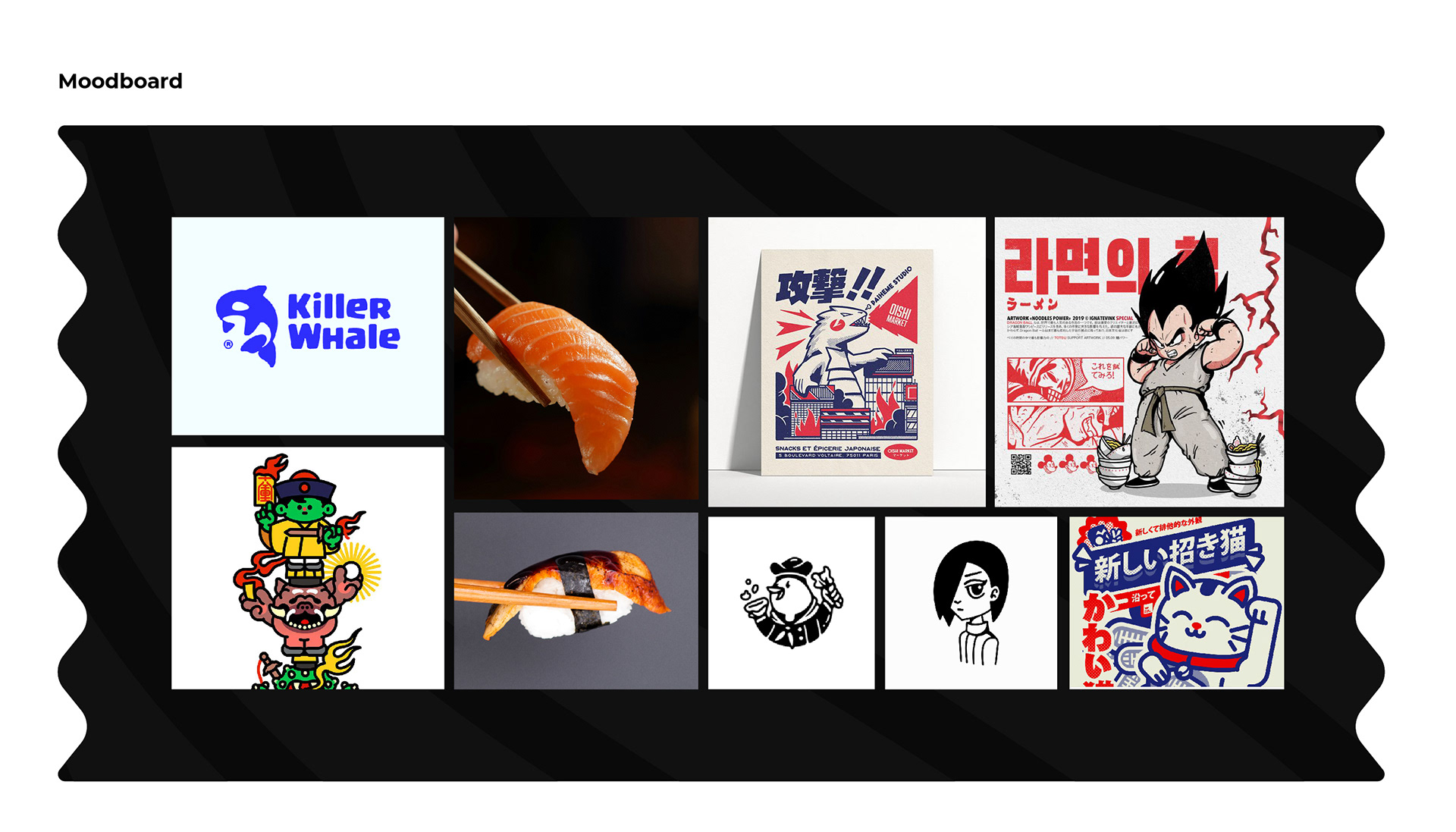
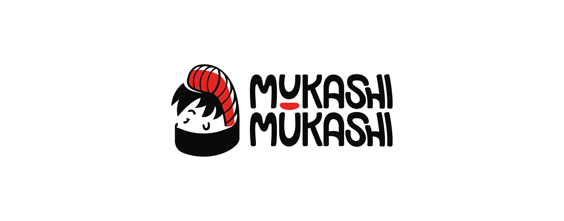
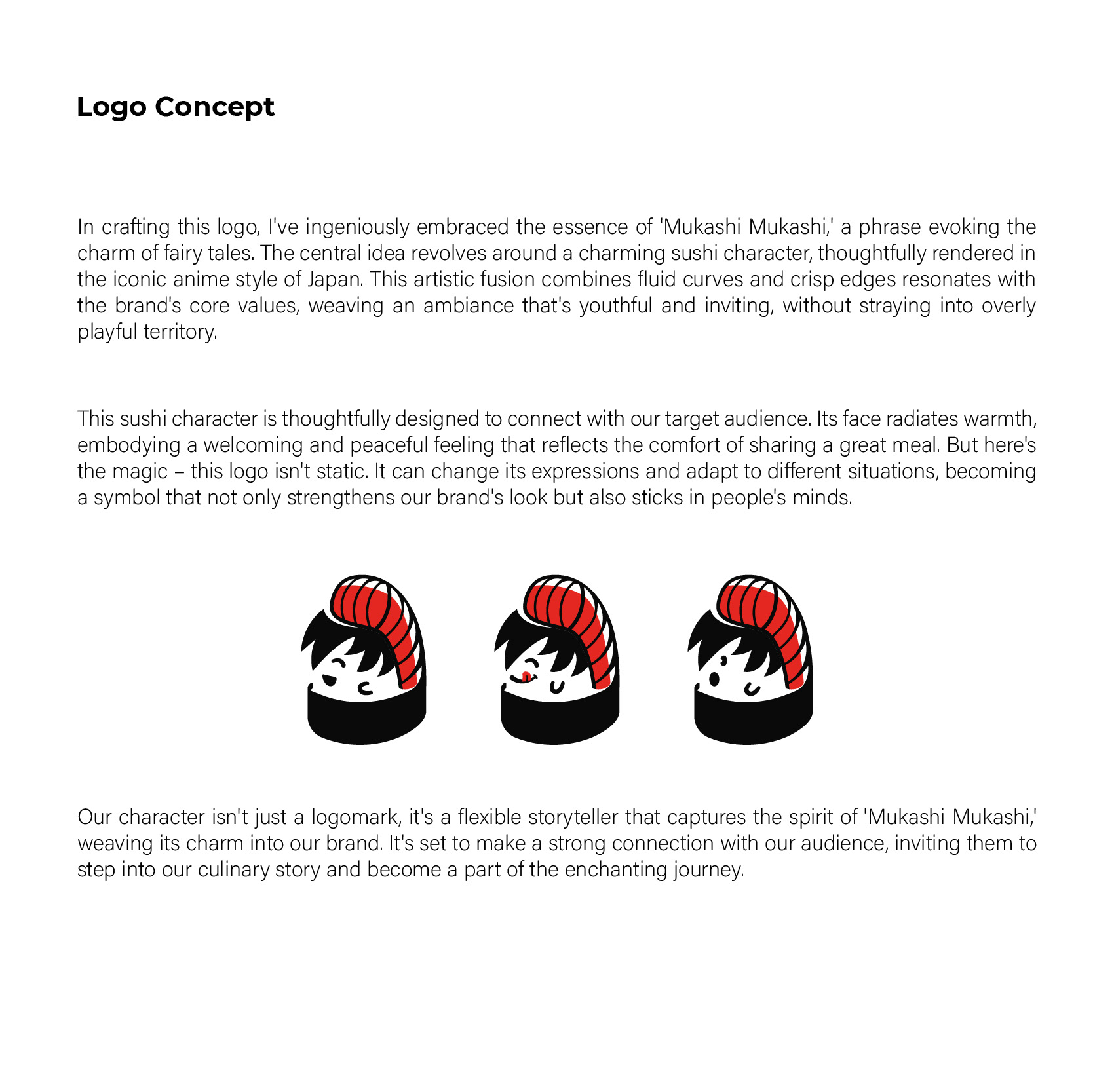
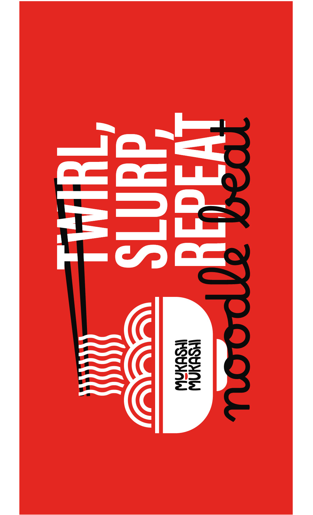
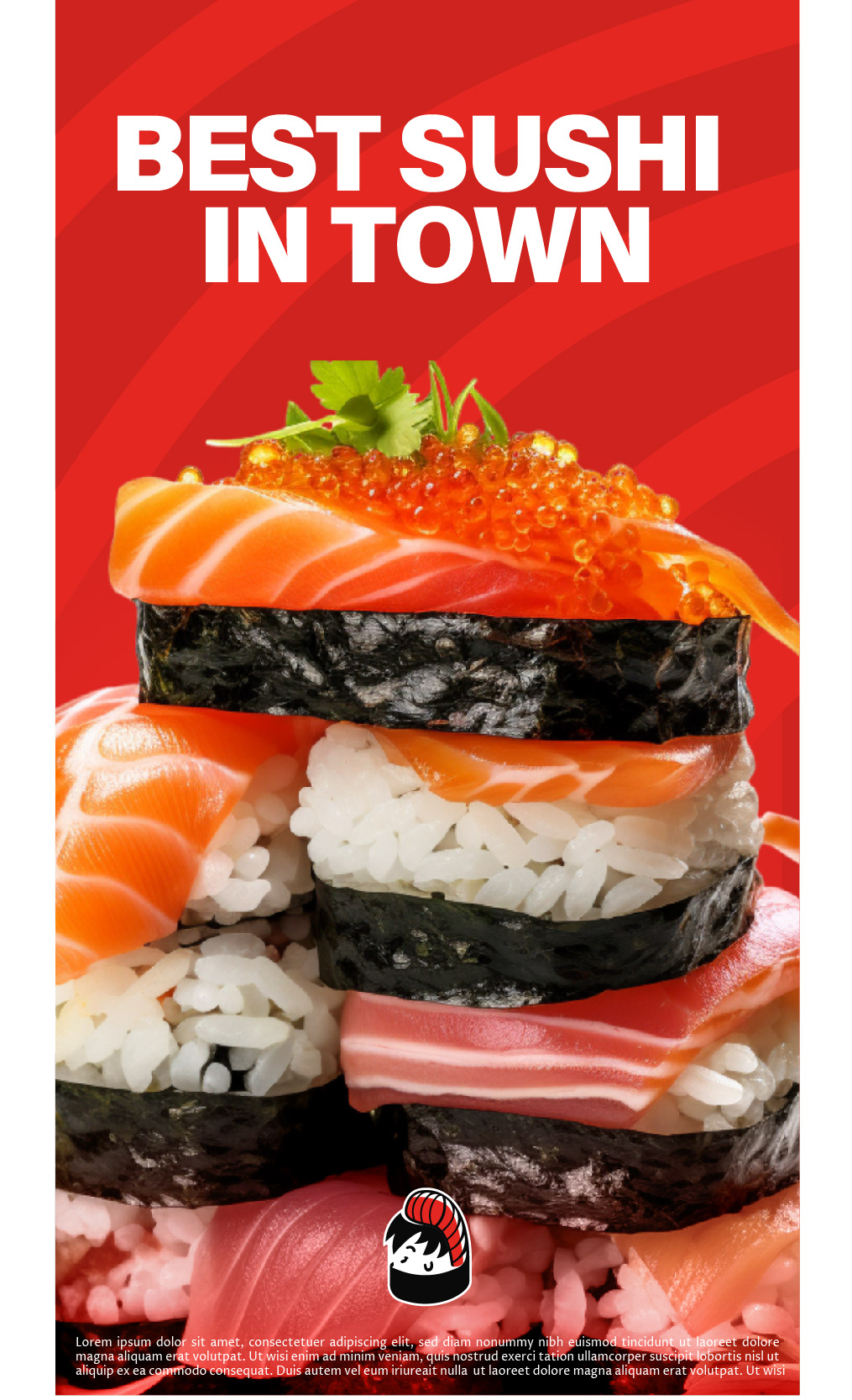
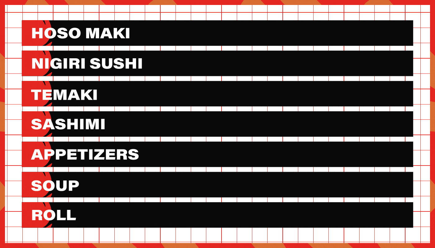
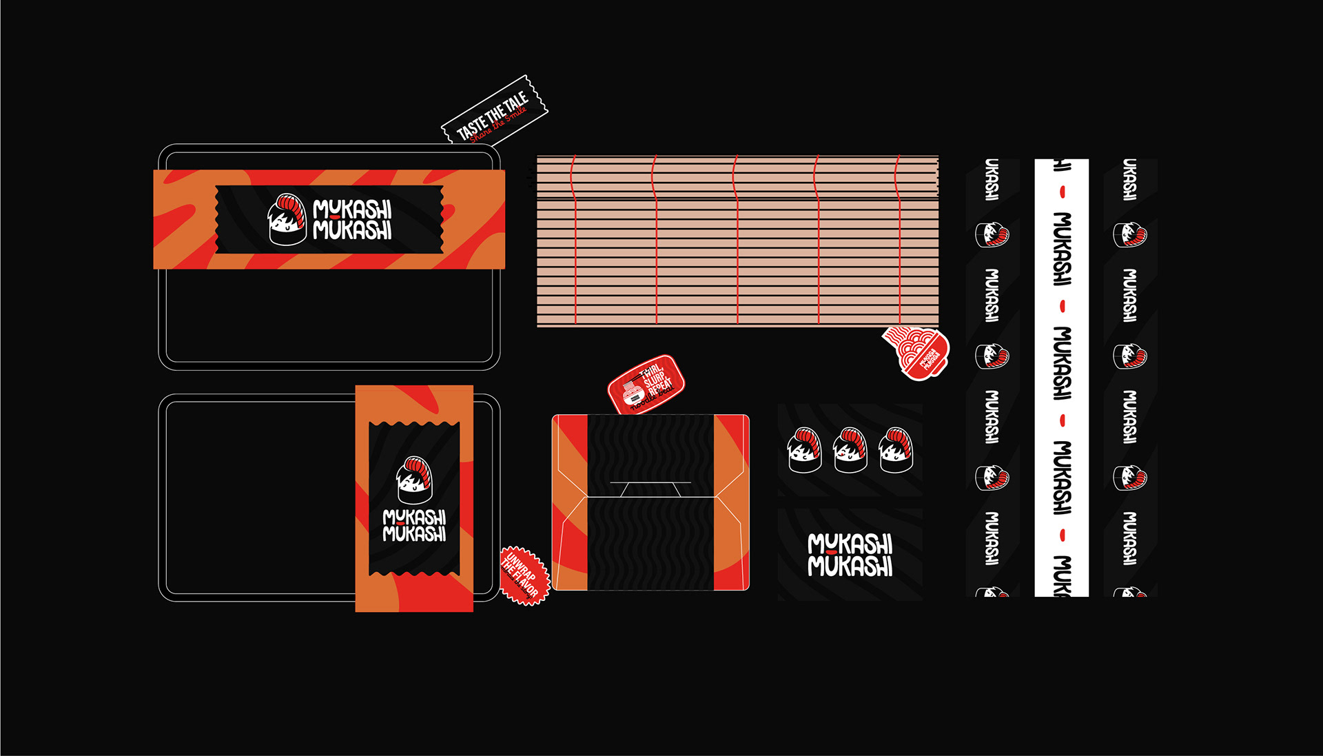
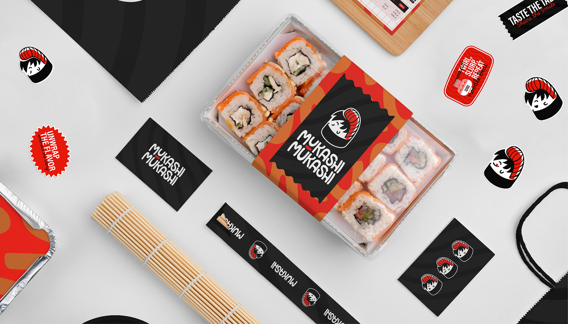
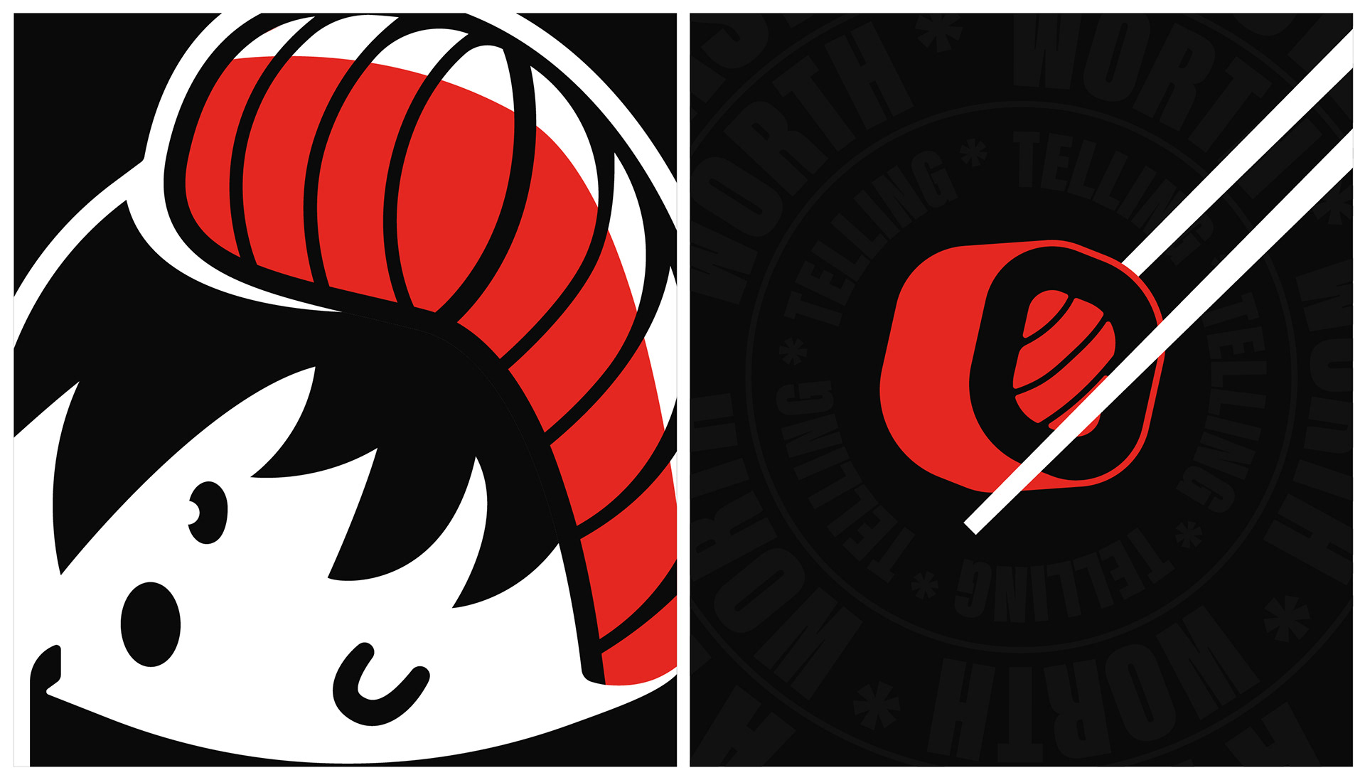
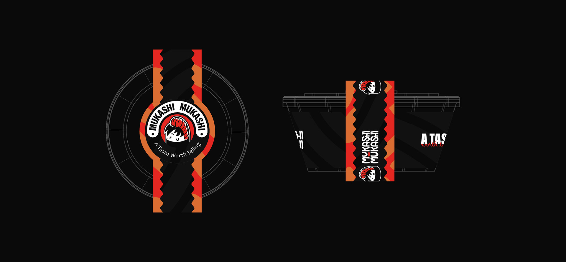
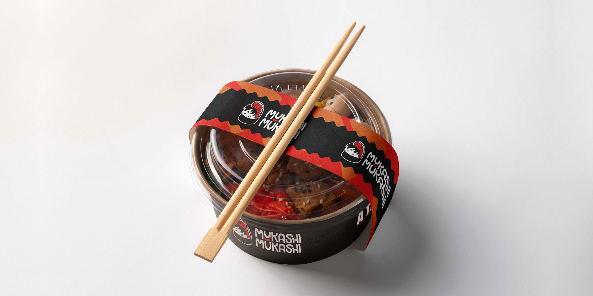
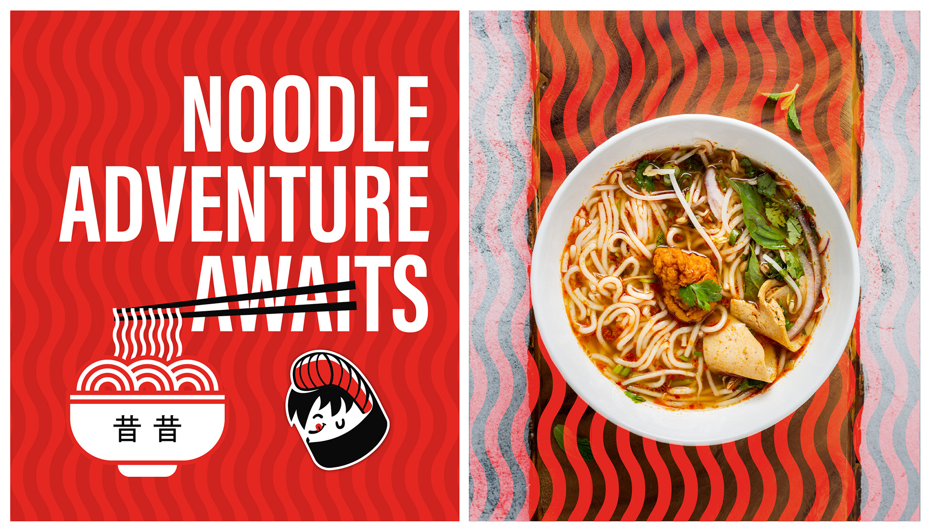
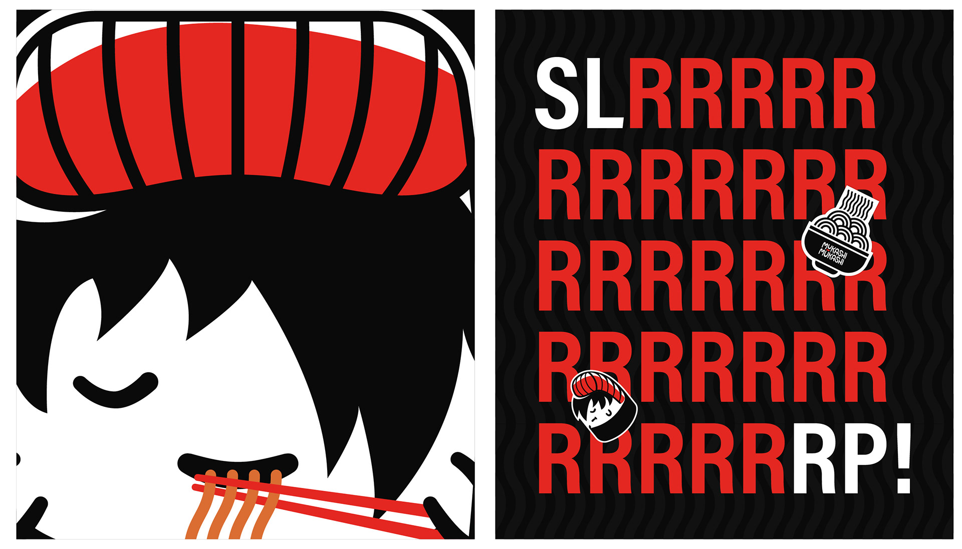
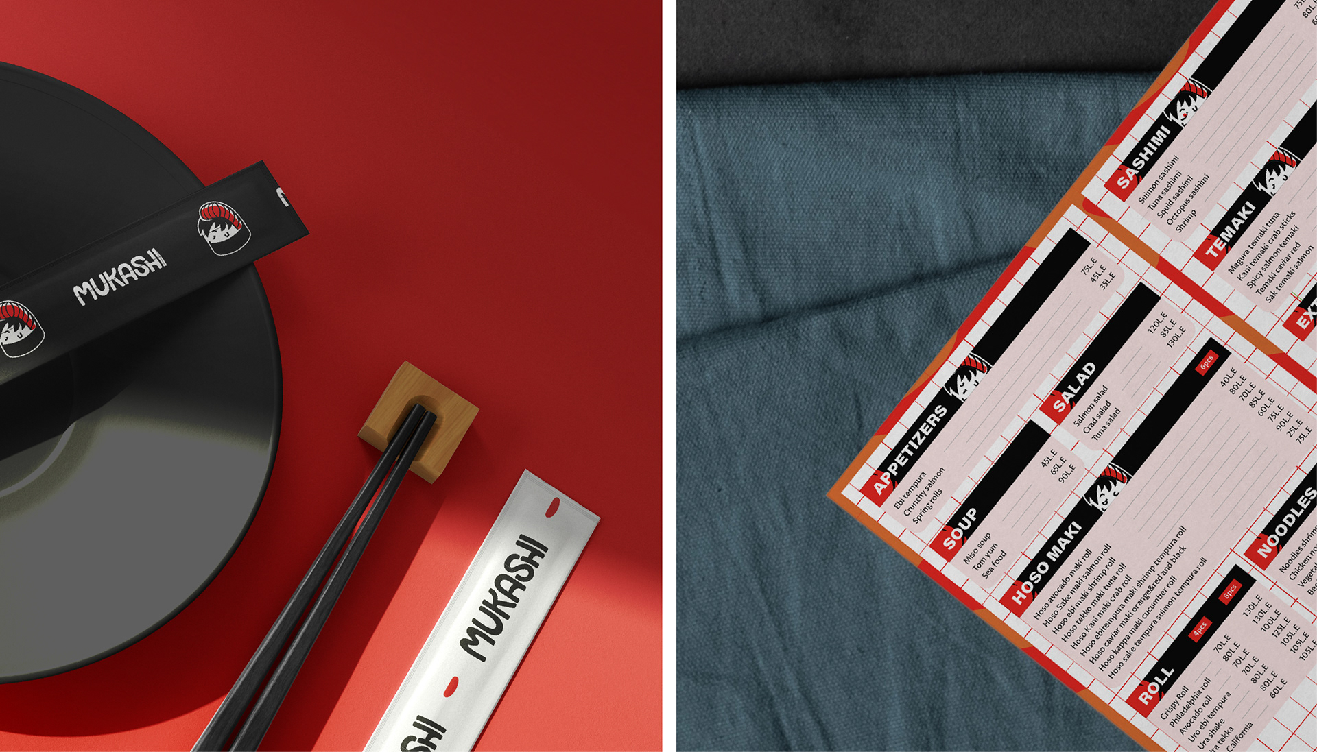
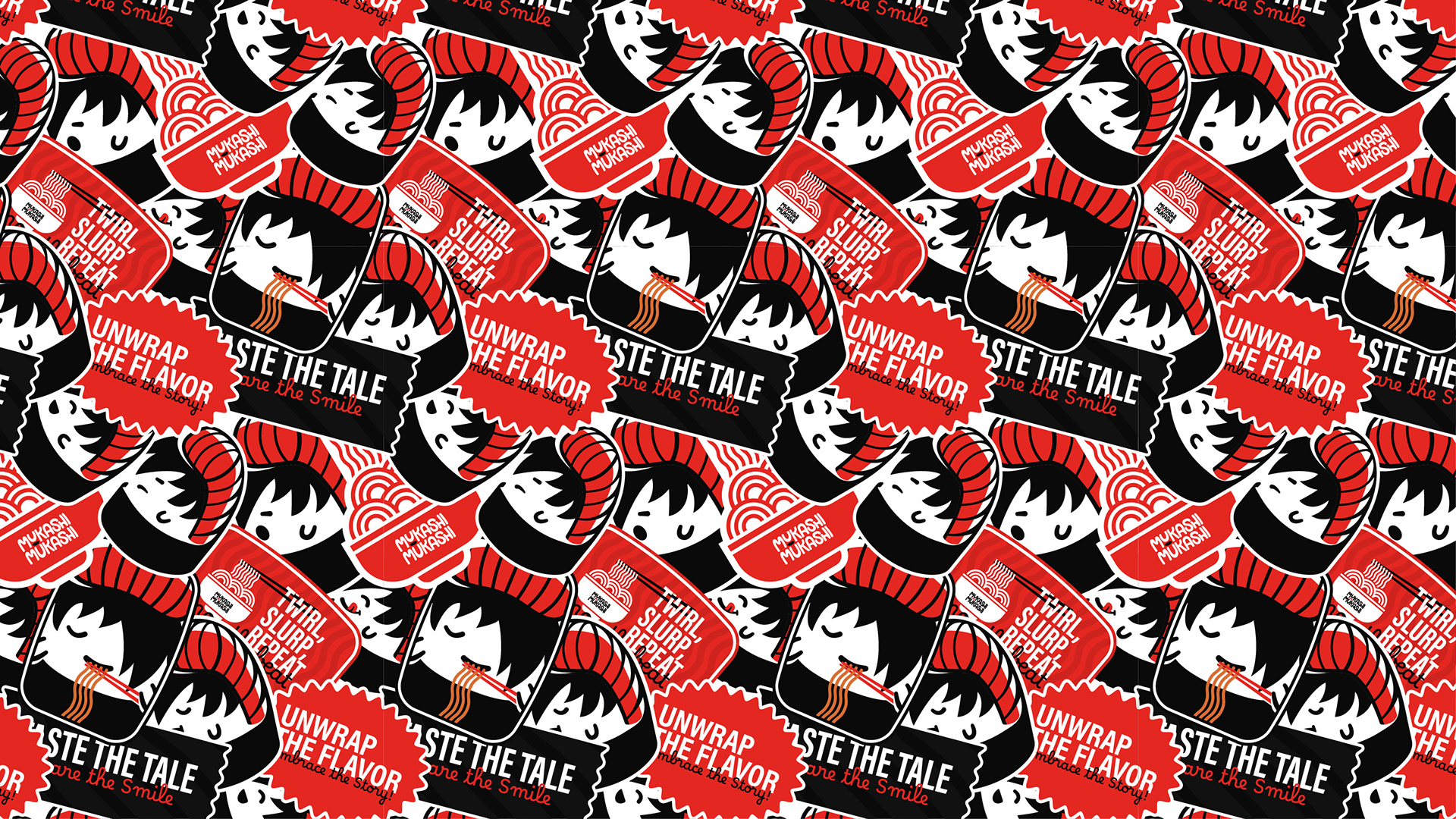
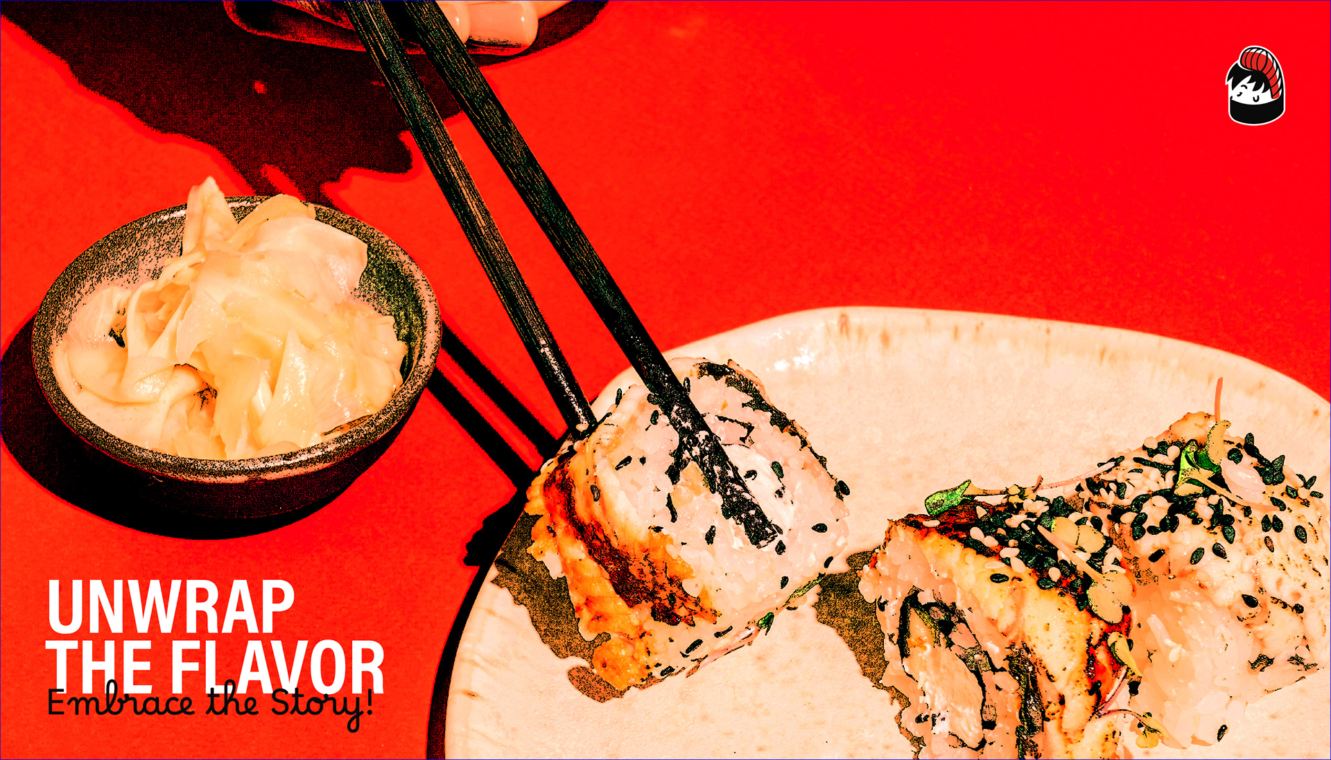
At its core, Mukashi Mukashi is about storytelling. The name itself means “once upon a time,” setting the stage for a unique dining experience where every visit feels like stepping into a new adventure. The brand’s identity revolves around a playful, anime-inspired sushi character—designed to be fun and relatable to the target audience of 16-30-year-olds who enjoy trying new things and spending time with friends.
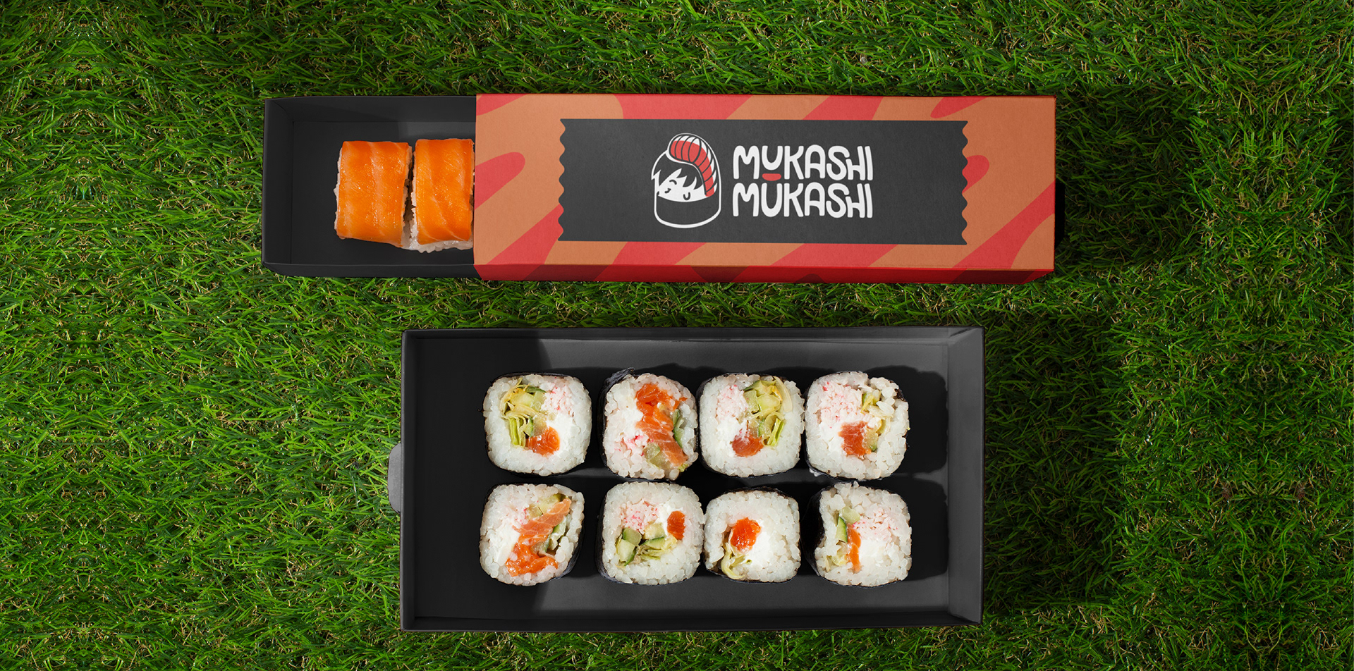
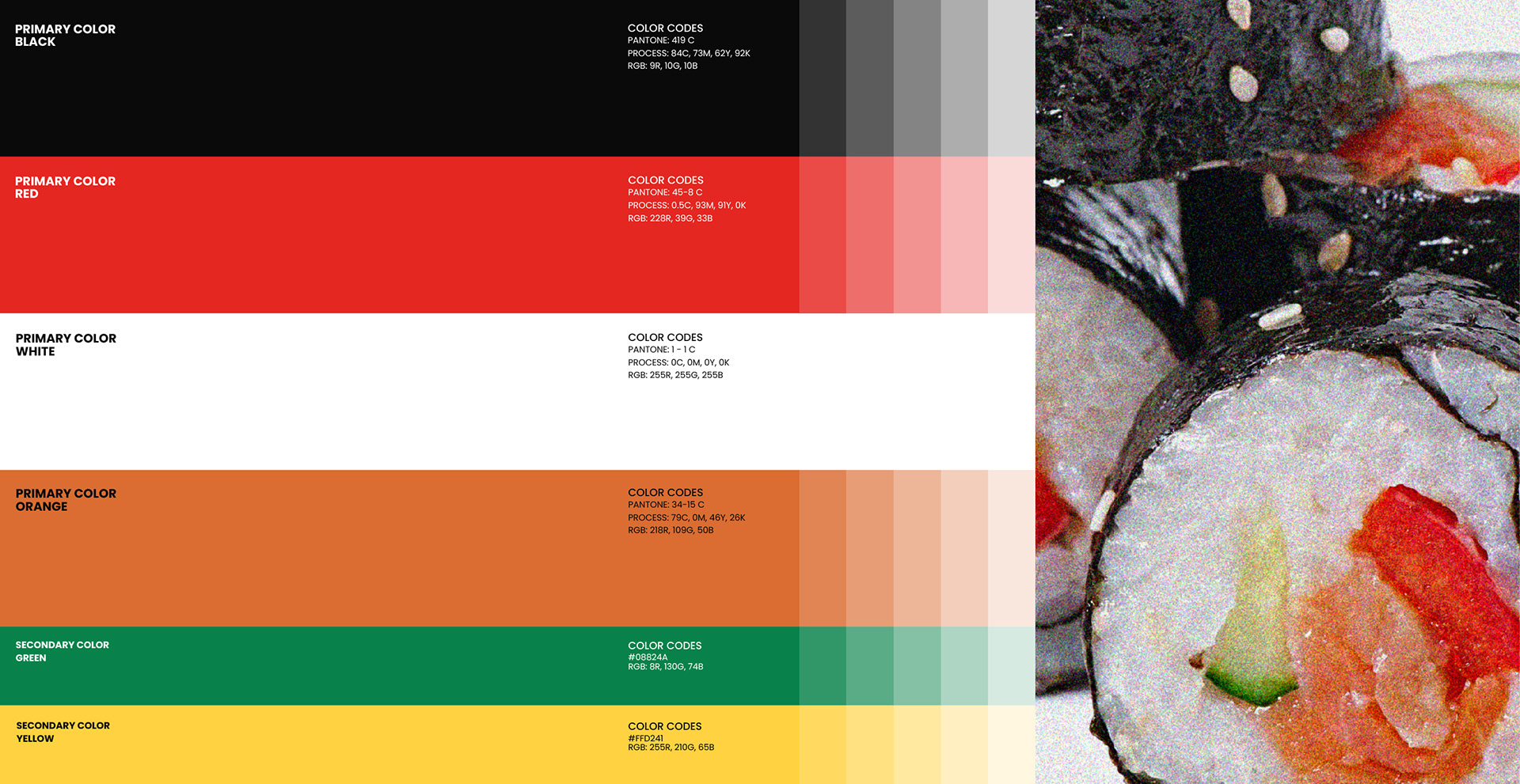
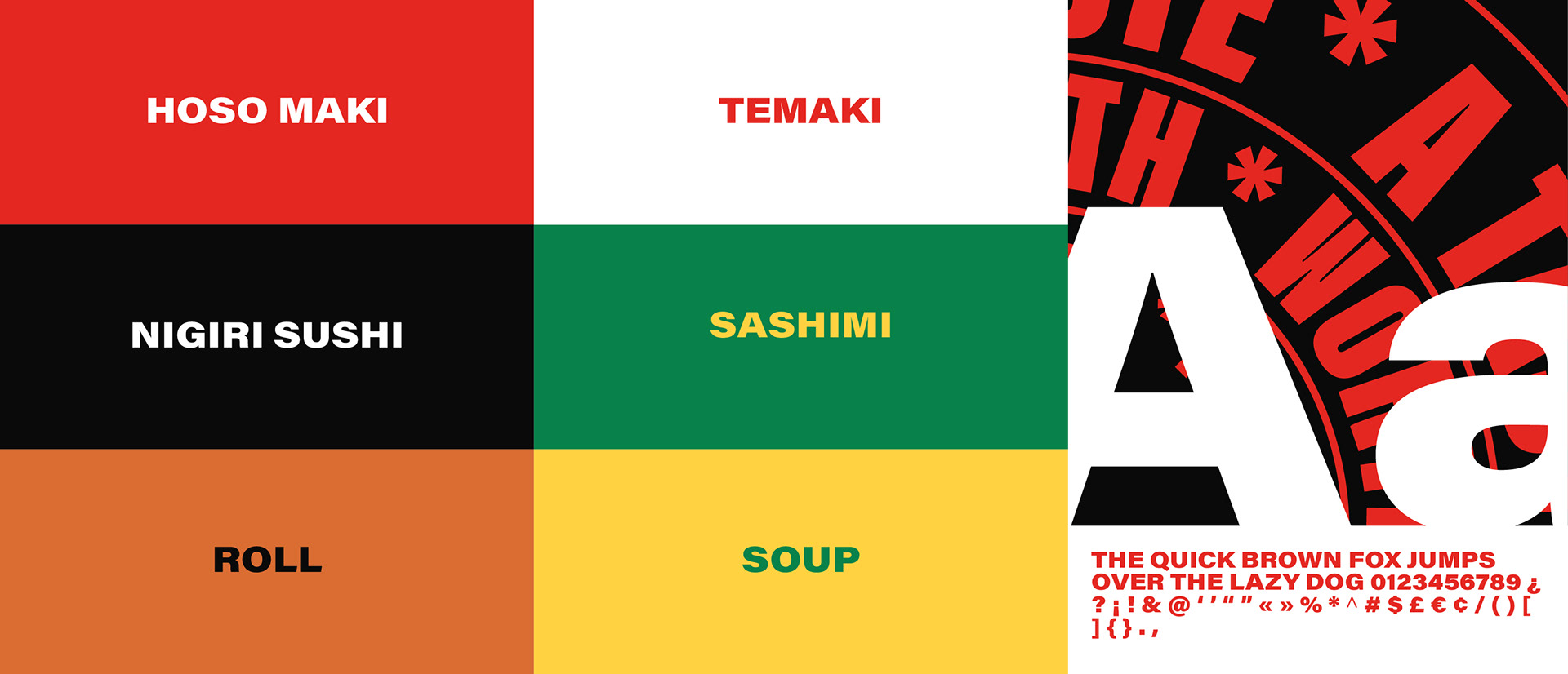
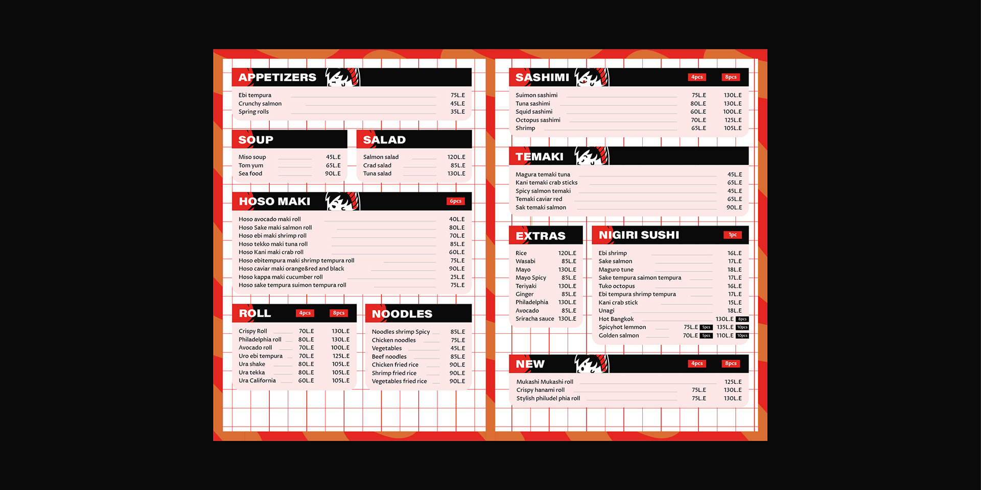
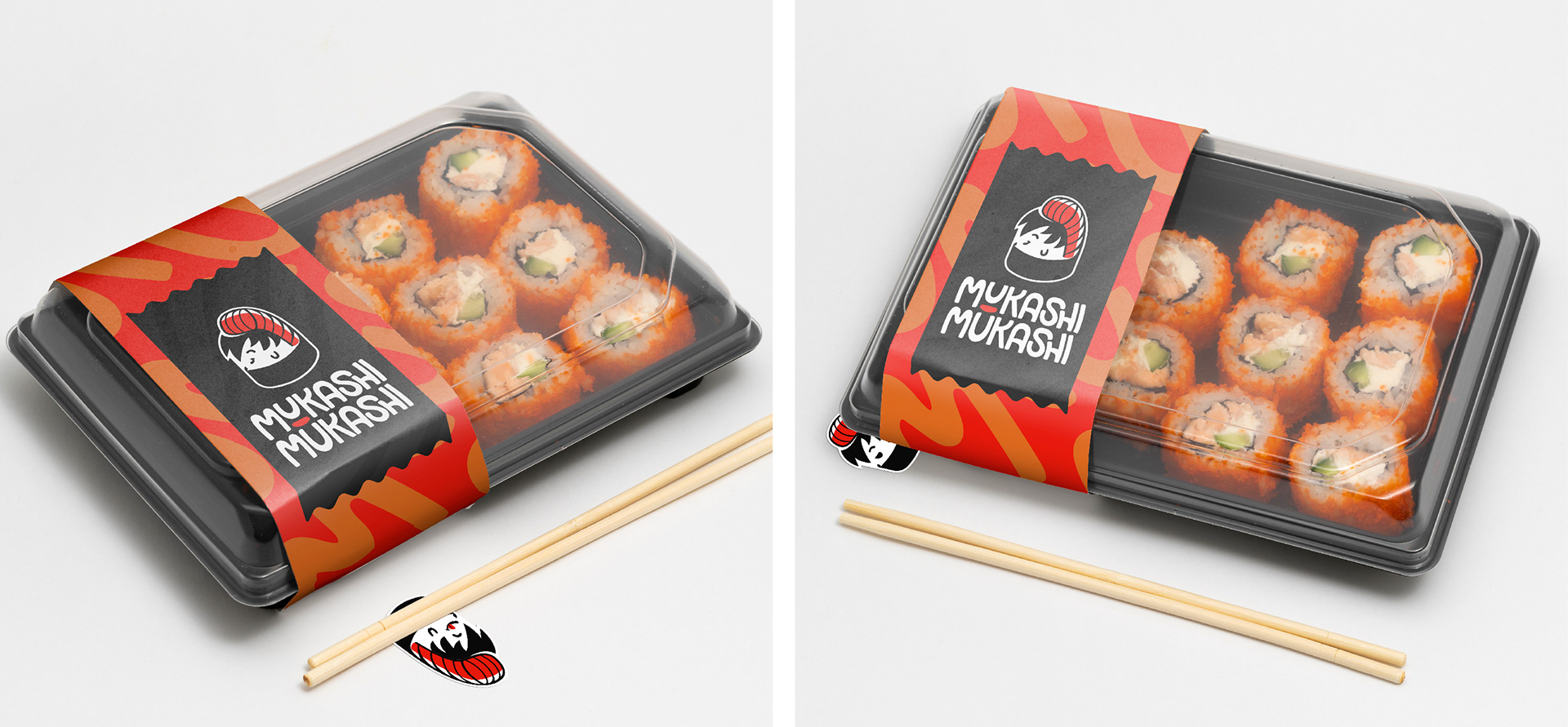
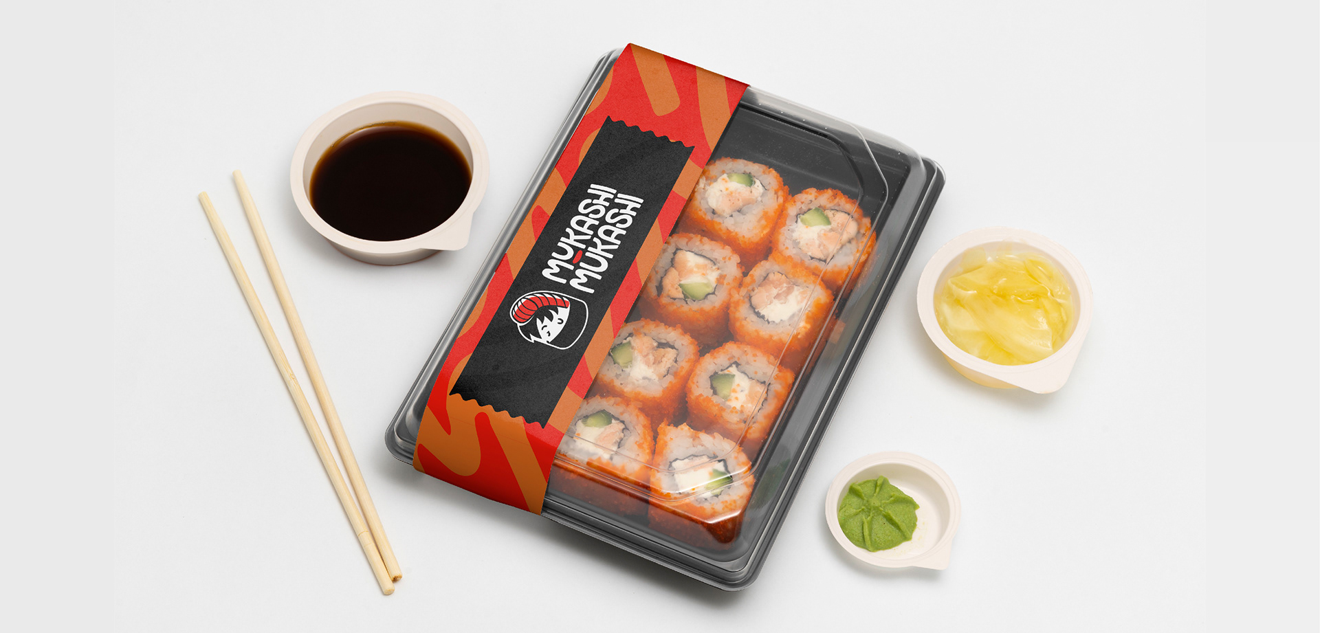
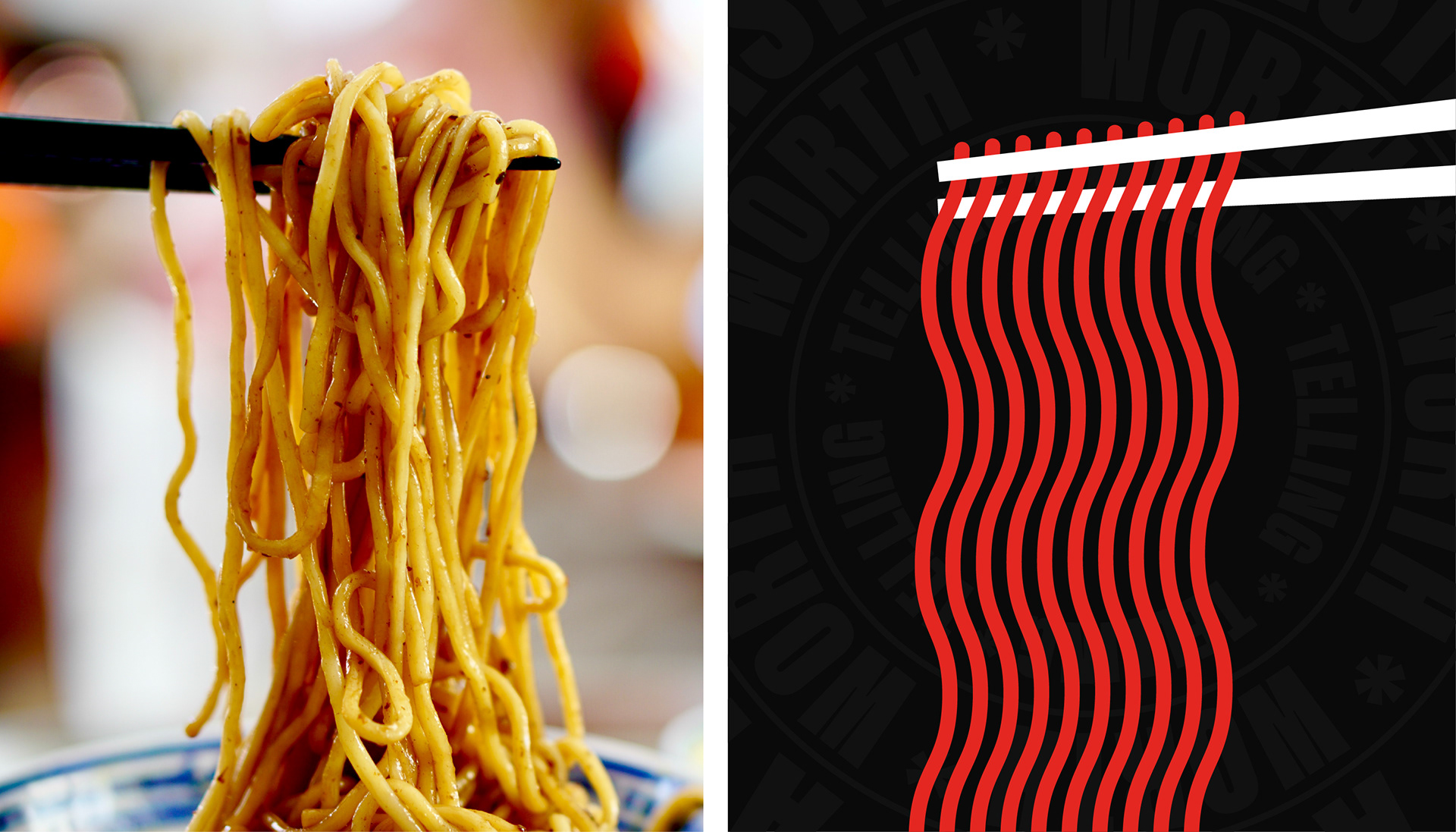
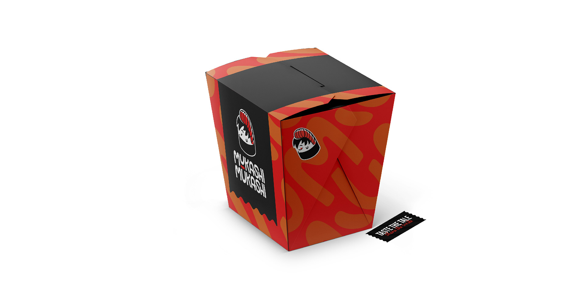
The color palette was carefully chosen to reflect the vibrancy and freshness of sushi ingredients—using bold reds, oranges, blacks, and whites. Together, these colors bring a youthful energy to the brand, while the sans-serif typography (Acumin Black) enhances the sense of boldness and fun, without straying too far from the brand’s professional edge.
The result? A dynamic visual identity that positions Mukashi Mukashi as a standout player in the sushi market. It strikes the perfect balance between being inviting, fun, and approachable, while still appealing to the adventurous spirit of its young, social target audience. The identity has successfully elevated the brand, helping it establish itself as a serious competitor and raising awareness in its community.