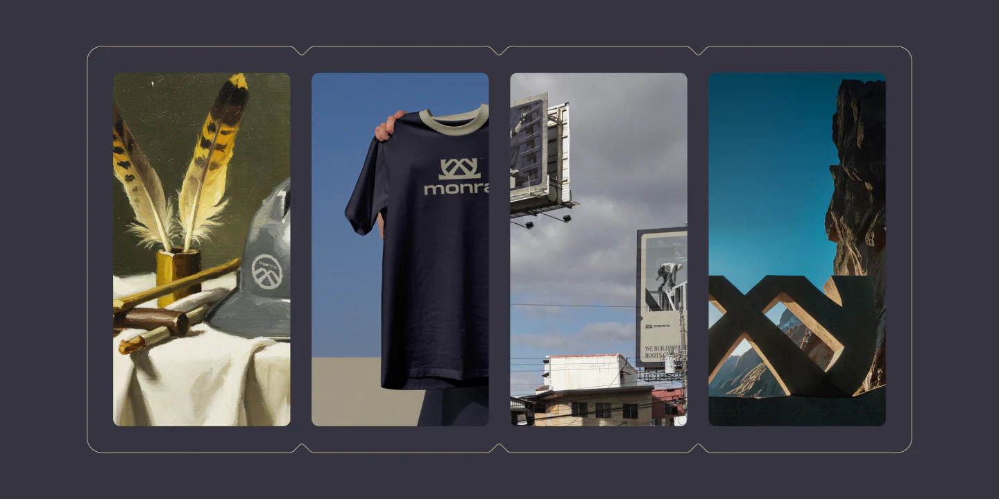
© Featured Project (No. 01 / 10) Branding

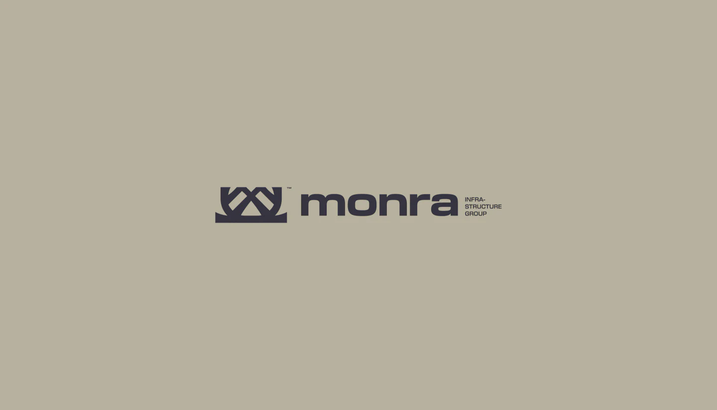
Monra™

Client
Monra Infrastructure Group
Year
2025
Focus
Strategy, Naming, Identity, Art Direction
Place
Aotearoa, New Zealand

BUILT TO STAY — SCROLL ↓

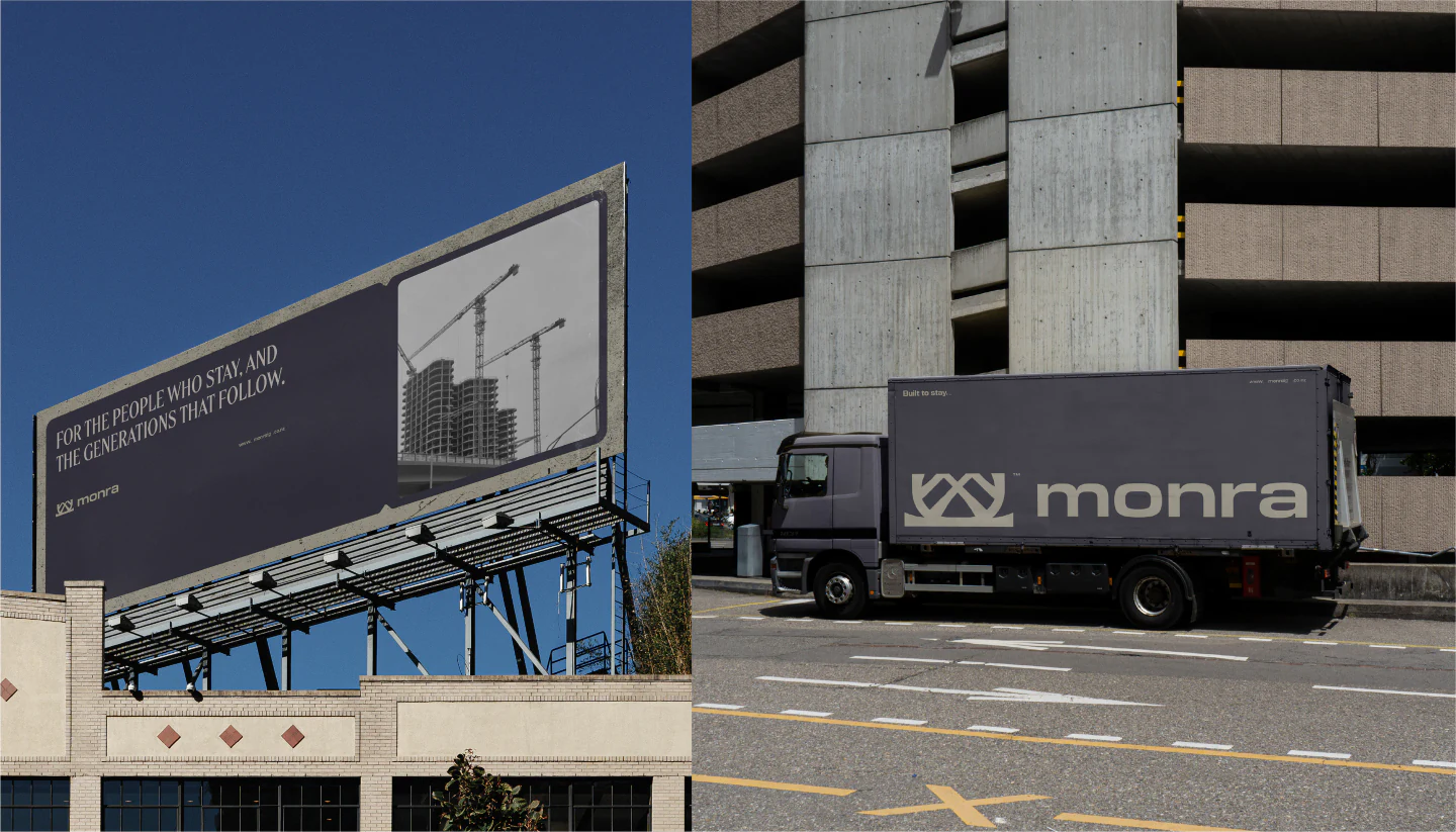
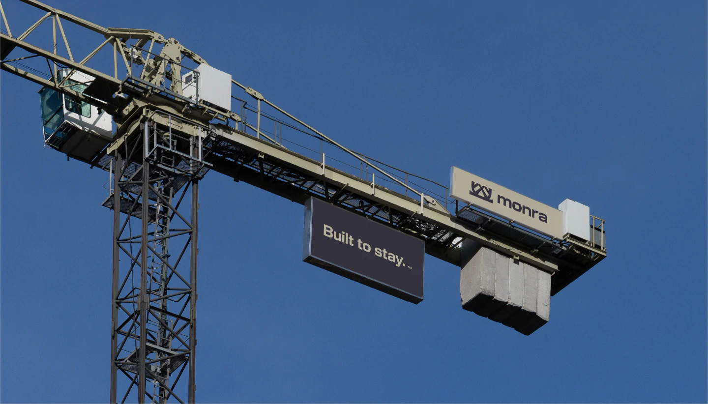
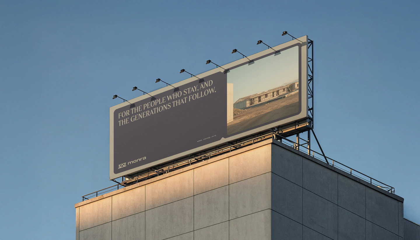
A Monra billboard on a rooftop at golden hour
© The Brief(WDX® — 01)Context

[01] The Brief

The task was to develop a comprehensive brand identity for a new infrastructure group based in New Zealand. The core challenge was to create a premium, future-focused identity that felt deeply rooted in Aotearoa: a complete visual and strategic system, from name and logo to tone of voice and art direction, deliberately moving away from the generic aesthetics common in the sector.
[02] The Problem

New Zealand’s infrastructure sector often communicates through a lens of cold functionality and corporate convention. It fails to connect with the deeper human need for belonging and permanence, in a country facing challenges with housing and community stability. There was room for a brand that speaks a different language: authenticity, long-term commitment and a genuine connection to the land and its people.

[03] The Solution

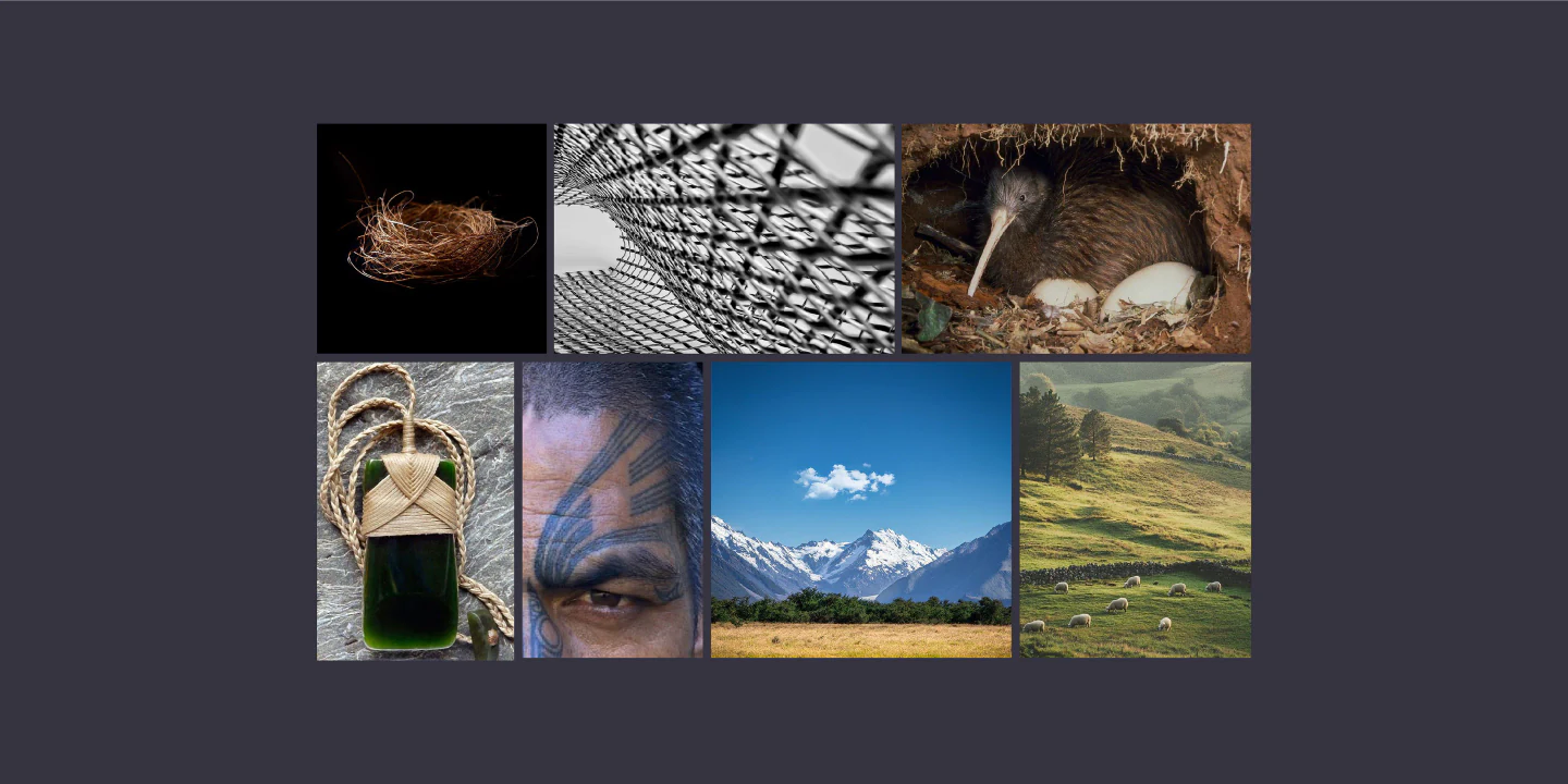
A brand strategy and identity that stands apart by leaning into substance and soul. A minimal, editorial visual identity inspired by the bird’s nest: a symbol of home, shelter and intentional construction. Monra is positioned not just as a builder, but as a long-term partner in shaping a more permanent and connected Aotearoa.

© The Big Idea(WDX® — 02)Strategy
©

A dual promise: enduring physical structures, and stable, rooted communities.

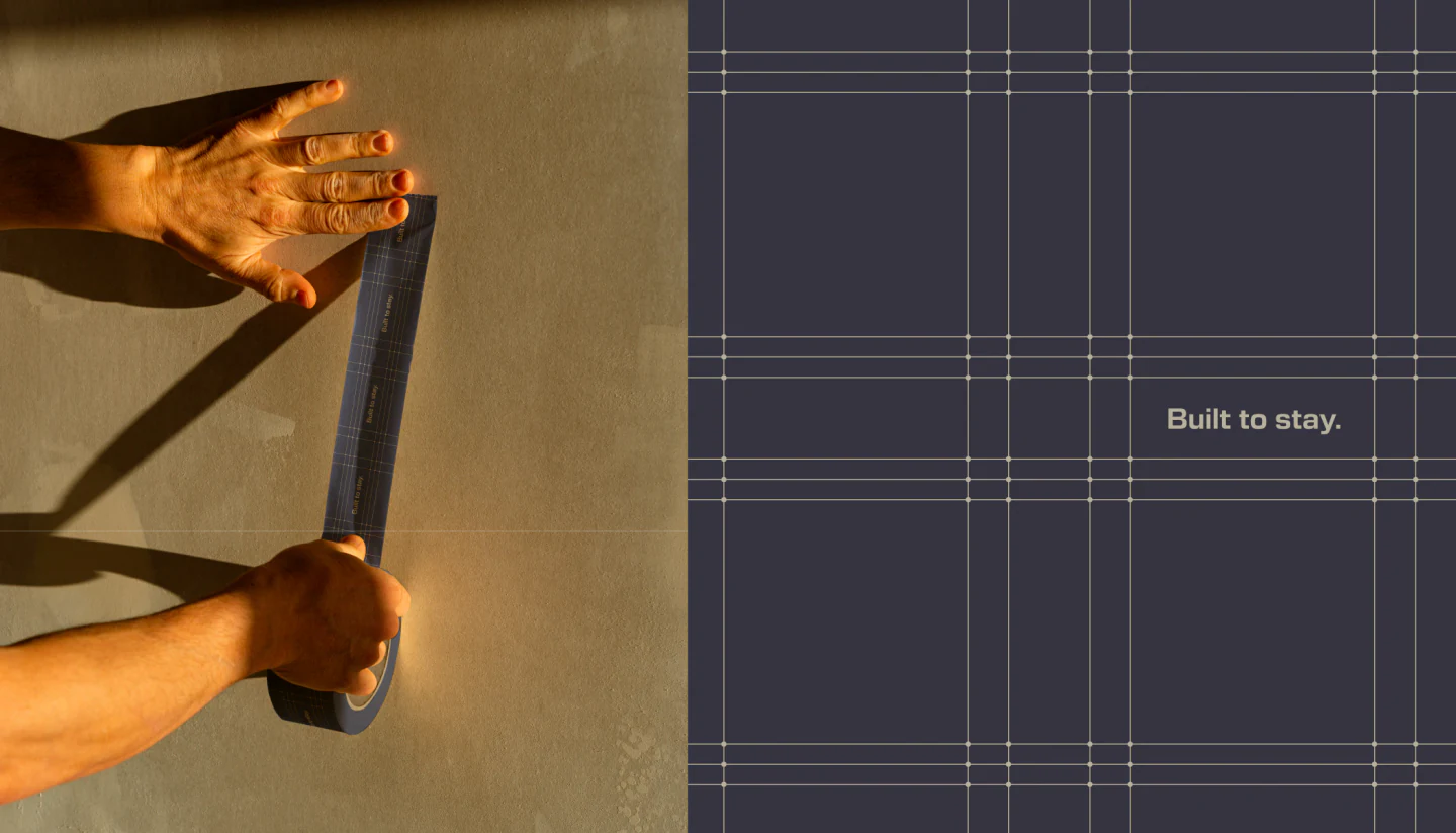
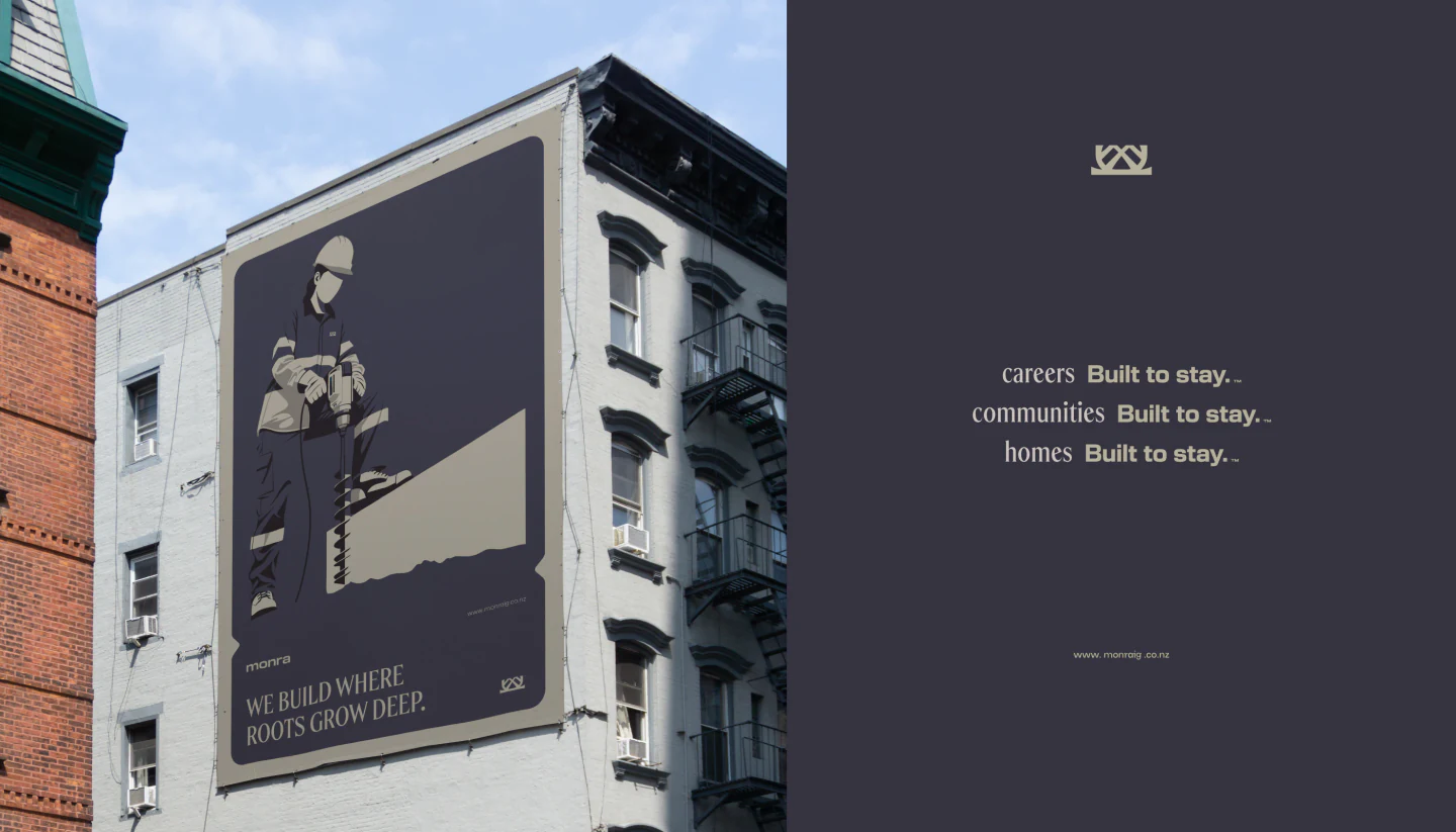
Built to Stay.

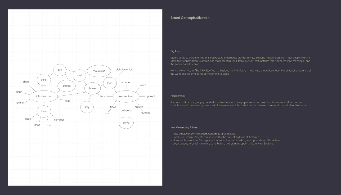
Monra exists to build the kind of infrastructure that makes staying in New Zealand not just possible, but deeply worth it. More than construction, Monra builds roots: long-term, human-first systems that honor the land, its people, and the generations to come.

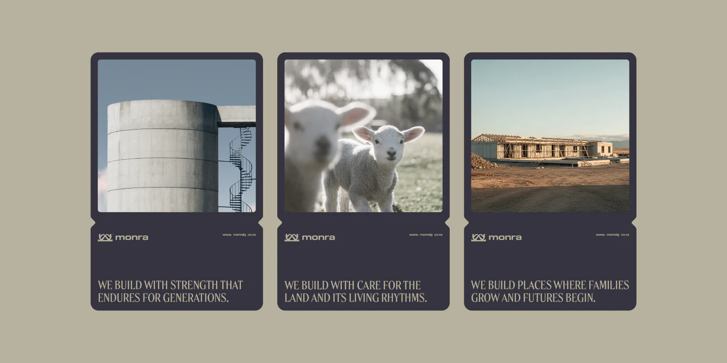
  • [01]Stay with StrengthInfrastructure that’s built to endure.
  • [02]Land-Led DesignProjects that respond to the natural rhythms of Aotearoa.
  • [03]Human InfrastructureCivic spaces that serve the people who grow up, work, and thrive here.
  • [04]Local LegacyA belief in staying, contributing, and creating opportunity in New Zealand.
© The Nest(WDX® — 03)Logo Concept

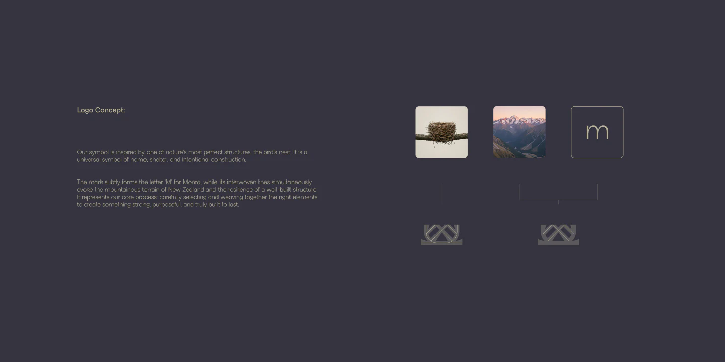
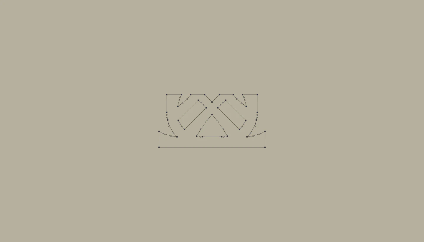
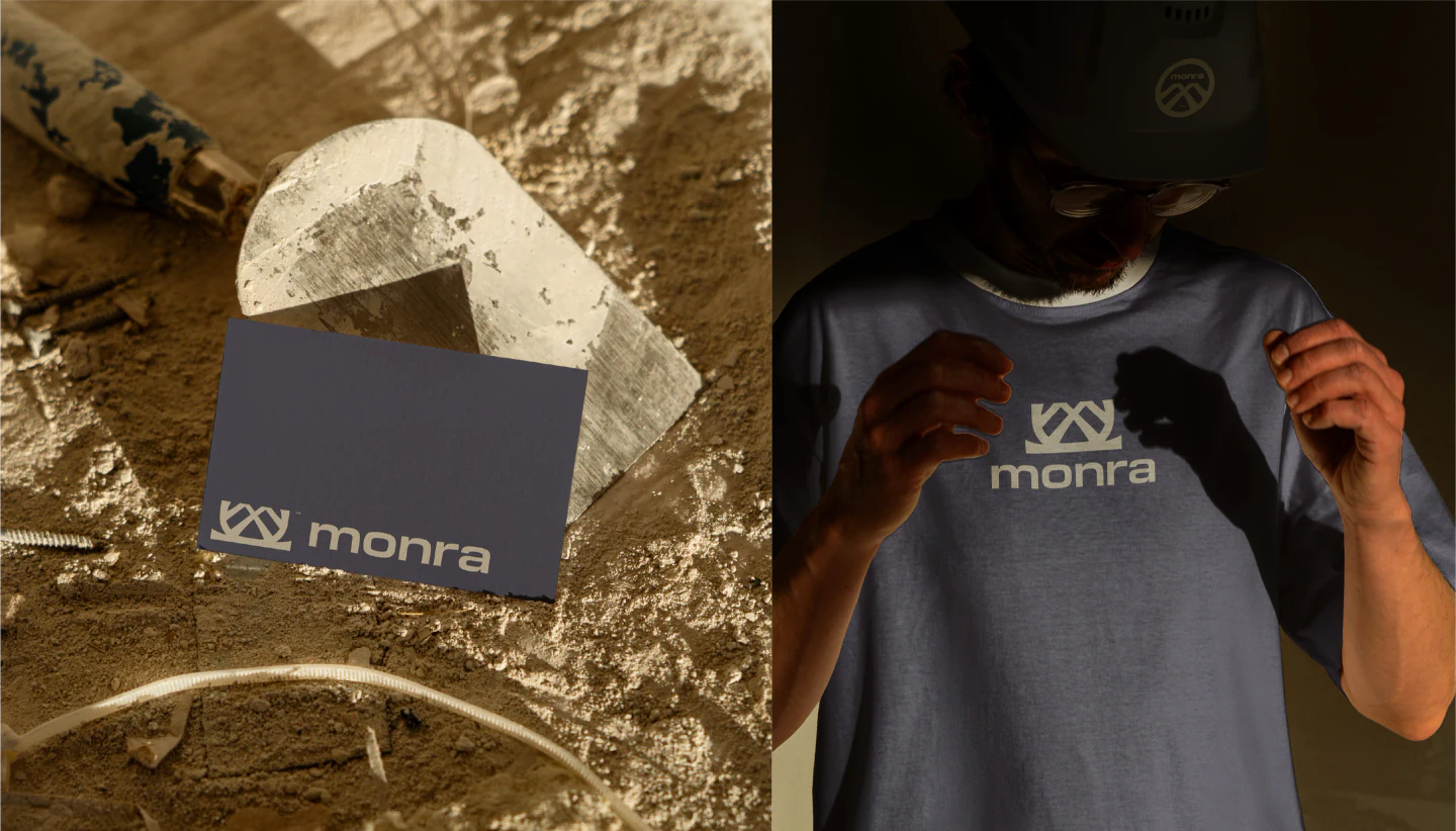
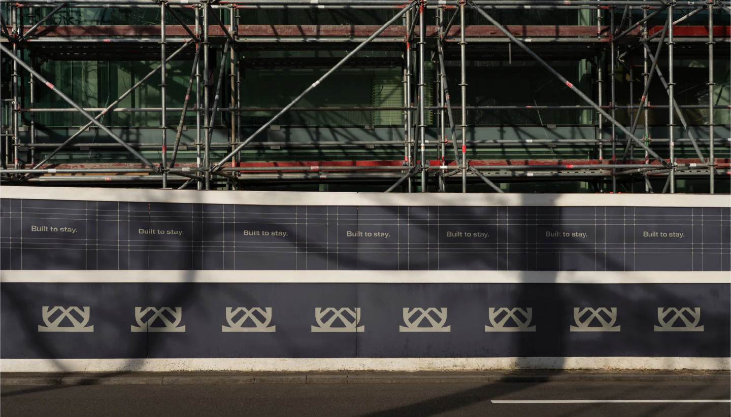
Our symbol is inspired by one of nature’s most perfect structures: the bird’s nest, a universal symbol of home, shelter and intentional construction. The mark subtly forms the letter M, while its interwoven lines evoke the mountainous terrain of New Zealand and the resilience of a well-built structure.

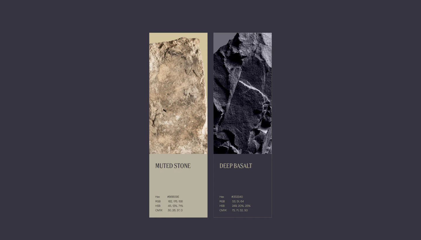
© Palette(WDX® — 04)Two Stones
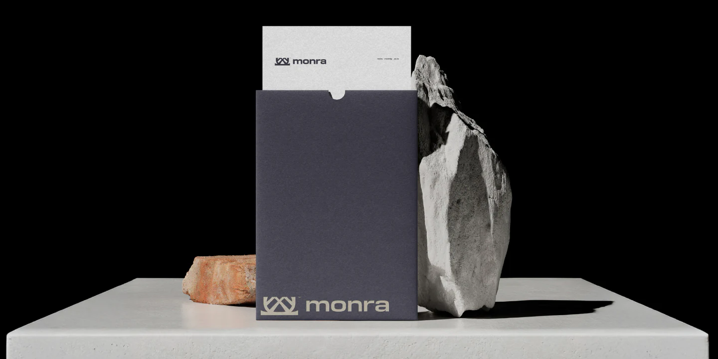
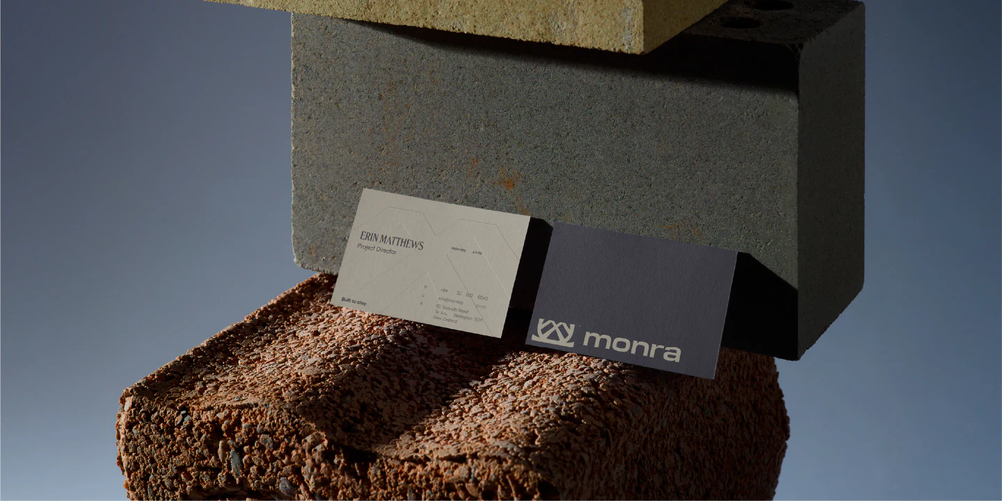
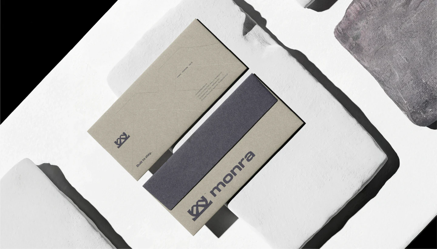
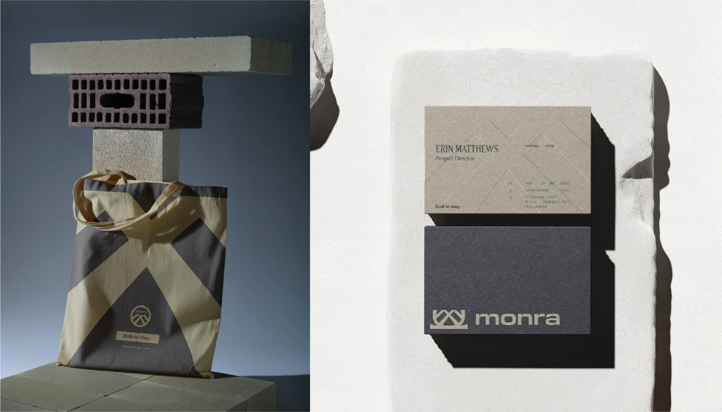
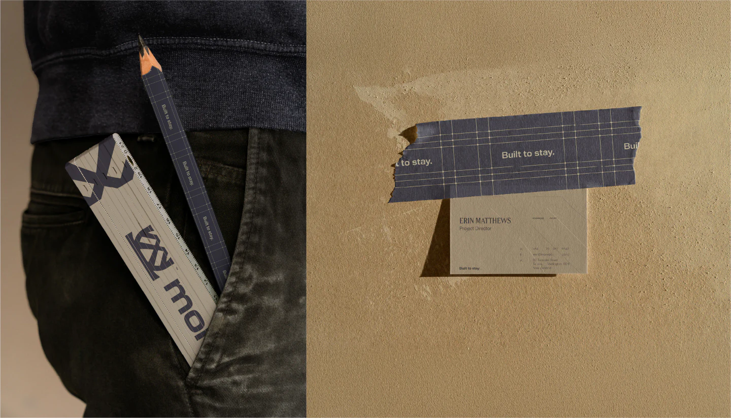
© Print & Stationery(WDX® — 05)Built to Last
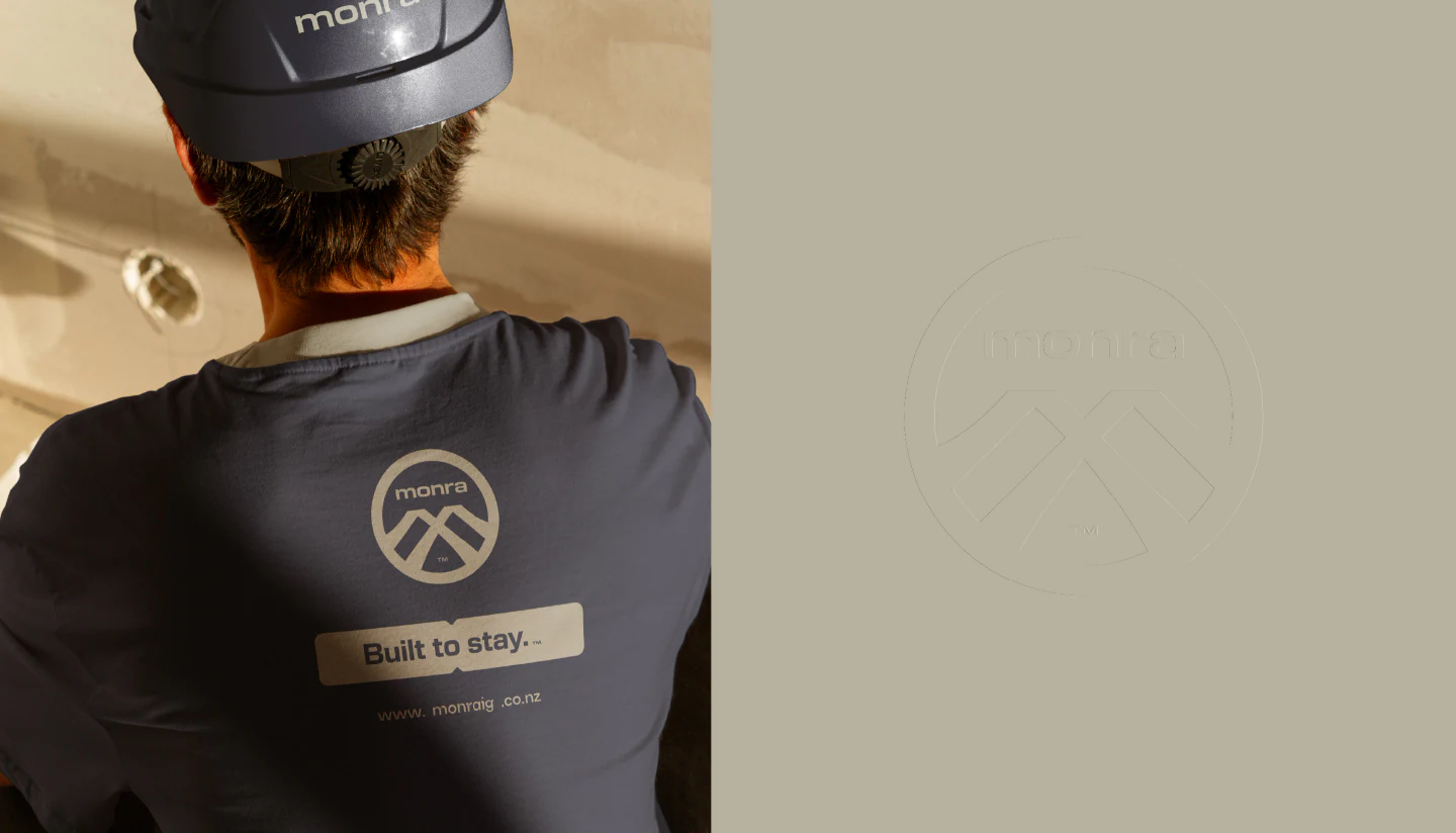
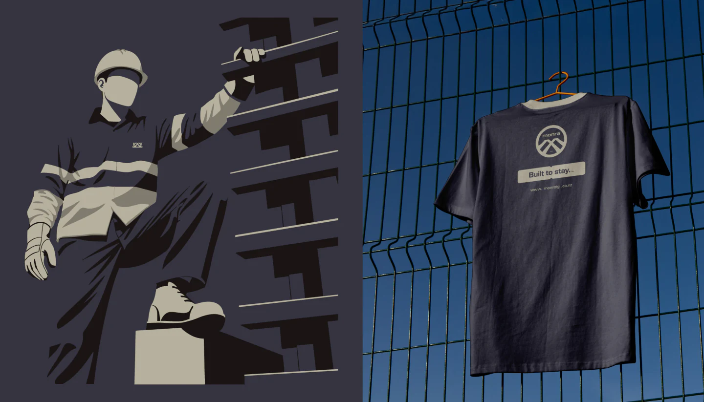
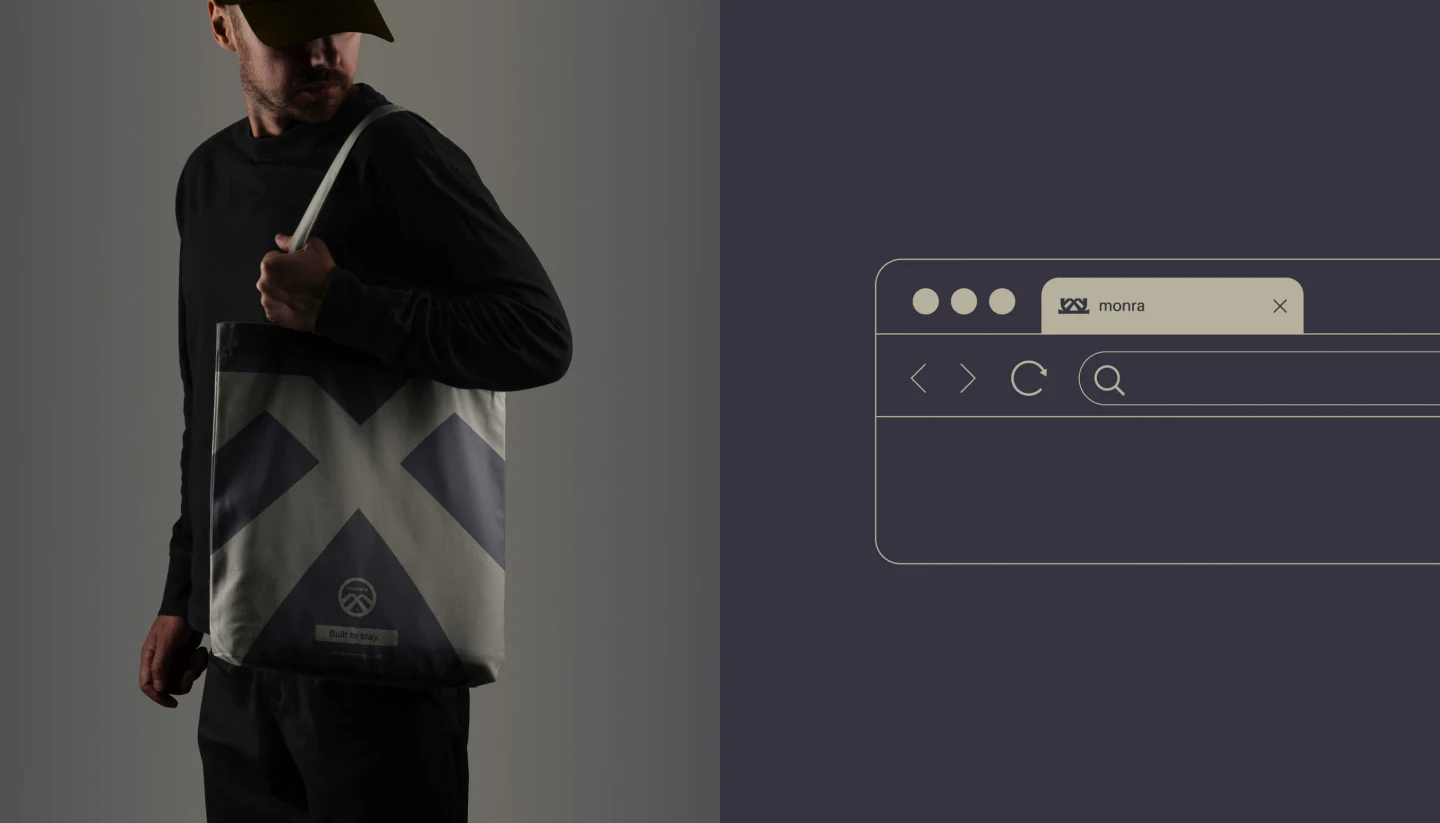
© Wardrobe(WDX® — 06)On Site
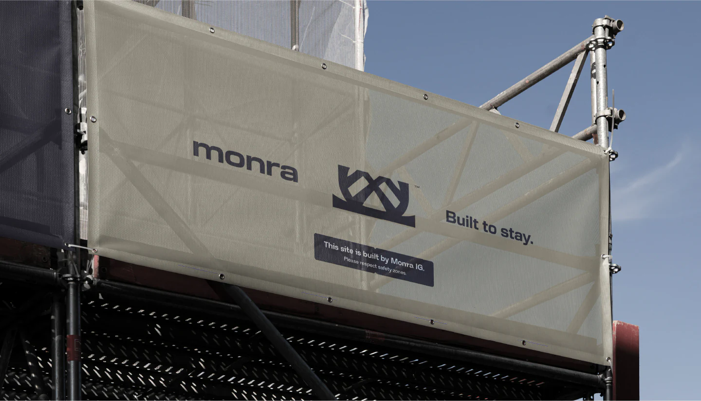
© On Site, In the City(WDX® — 07)Out in the World
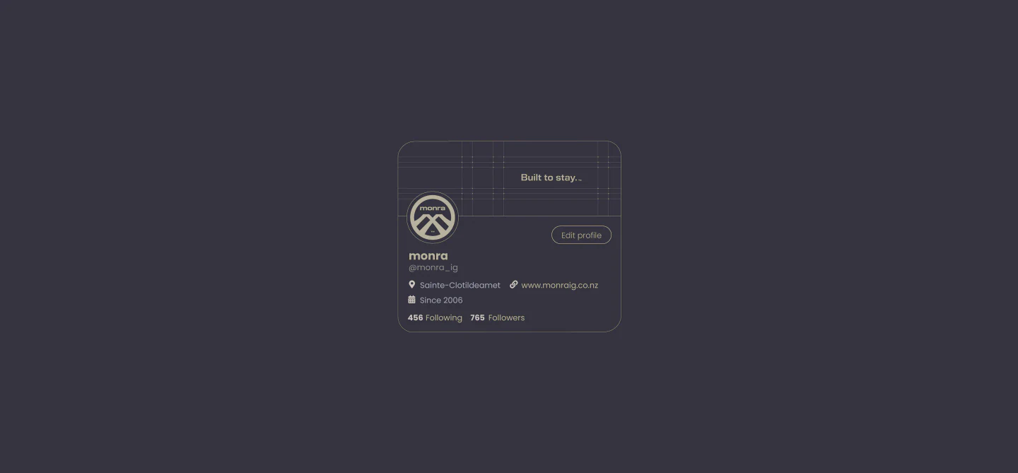
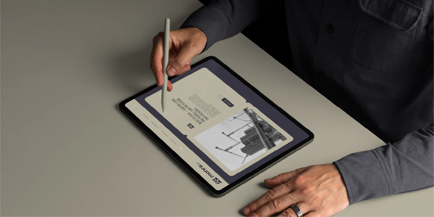
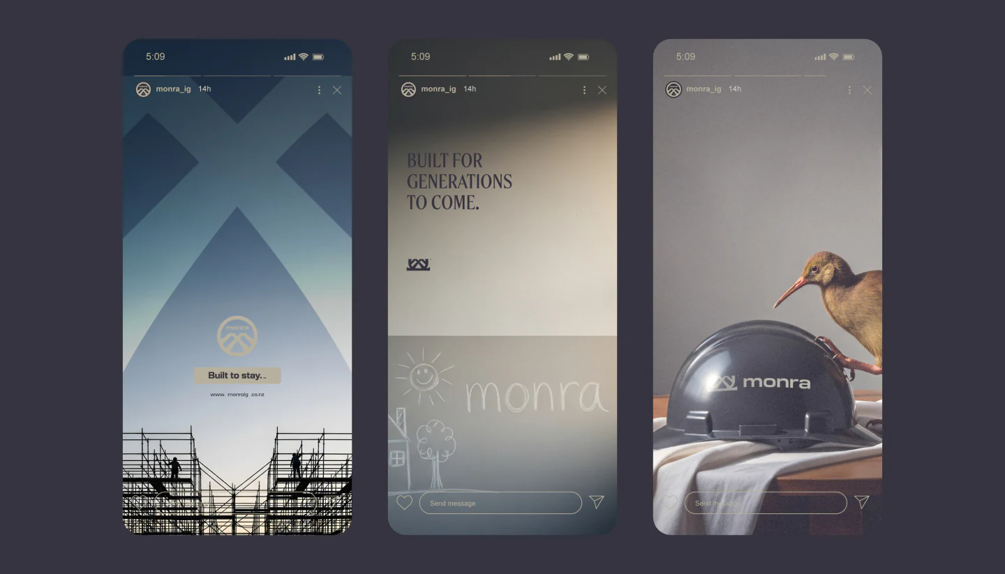
© Digital(WDX® — 08)Screens
(Recognition) Featured on World Brand Design ↗ (WDX® — 09) Next project SEDR® →
© Get in Touch(WDX® — 10)Say Hello

Building something meant to last?