© Featured Project (No. 09 / 10) Rebrand

109®

Client
109 Distribution Électrique
Year
2025
Scope
Strategy, Logo, Iconography, Digital
Place
Réunion Island
Scale
4 branches · 6,000+ products

FLOW FORWARD — SCROLL ↓

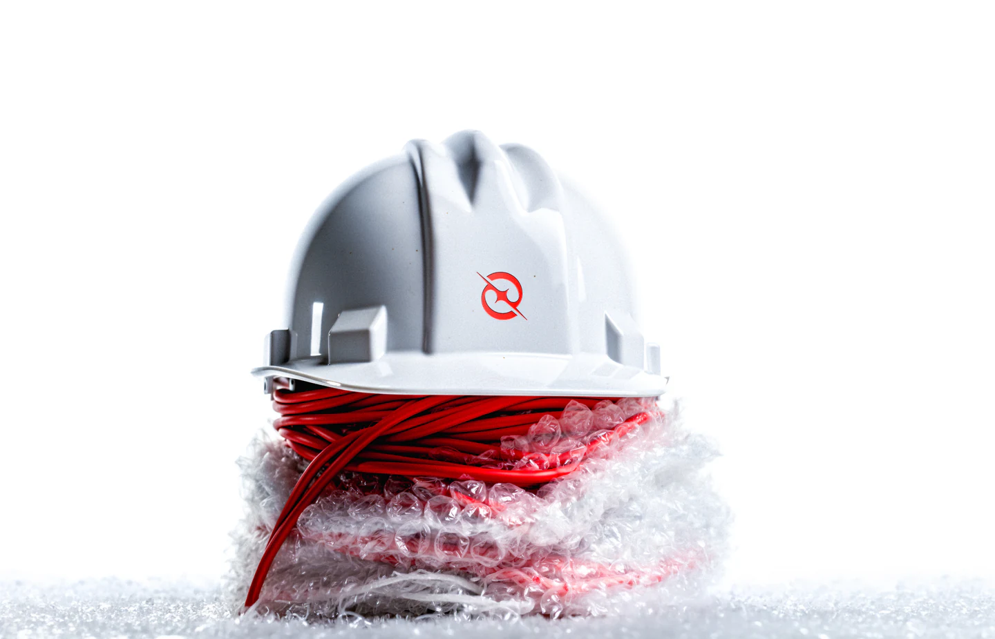
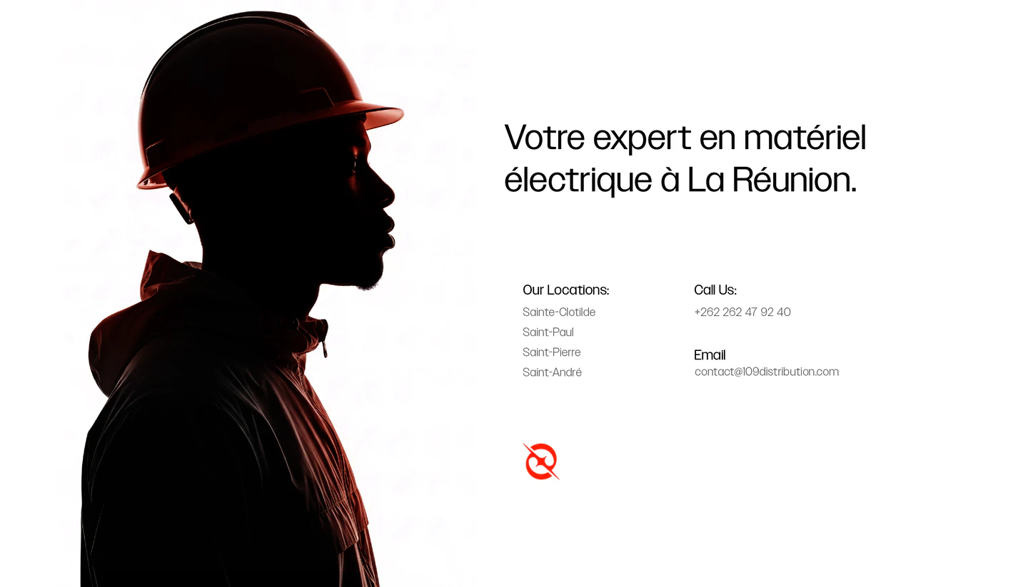
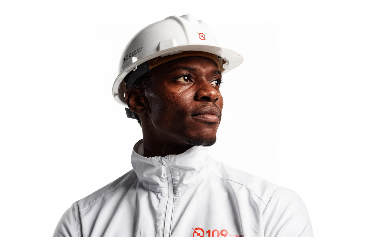
A worker in a white 109 jacket and hard hat
© The Brief(WDX® — 01)Context

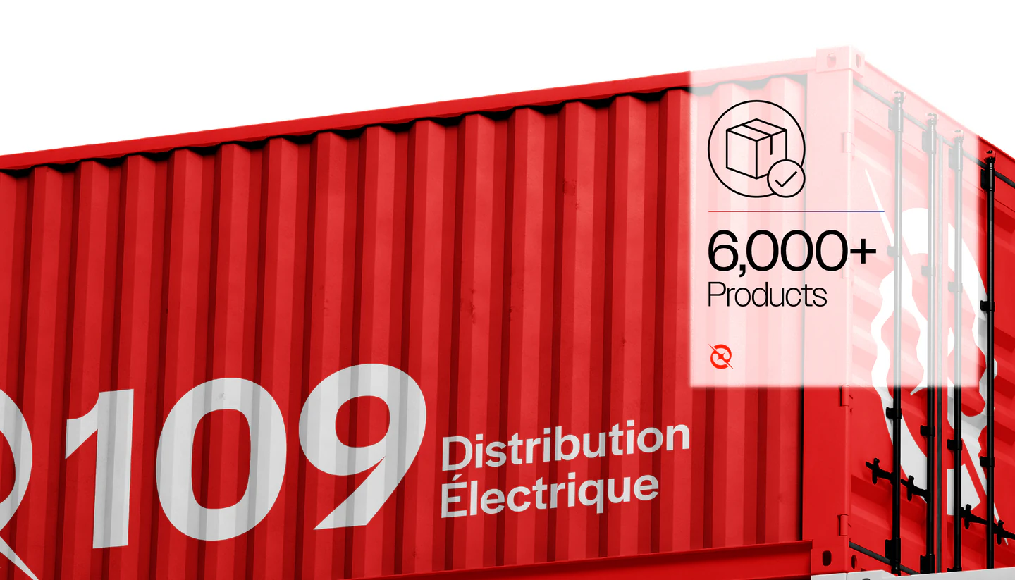
109 Distribution Électrique is a well-established electrical distributor on Réunion Island, operating through four major branches for full island coverage. With over 6,000 products, it serves professionals and businesses with reliable access to electrical and lighting solutions.

[01] Vision

To become a pioneer of electrical solutions on Réunion Island by reinventing distribution and service, while enriching the local community through innovation and excellence, with a strong digital presence that expands the brand’s scale and reach.

[02] The Problem

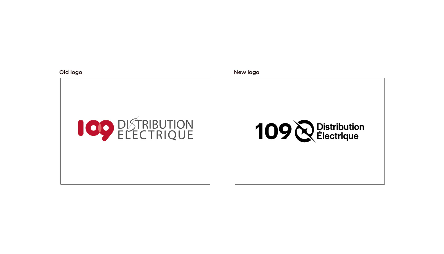
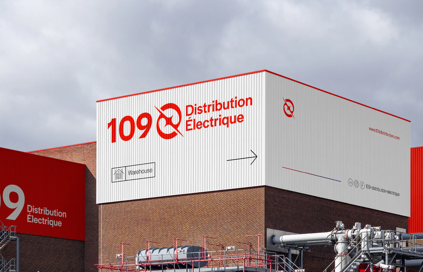
Despite a strong operational foundation, 109 lacked a cohesive design system, leaving a fragmented presence across physical and digital touchpoints. The old logo failed to express the brand’s energy and movement, and its rigid structure limited adaptability.

[03] The Solution

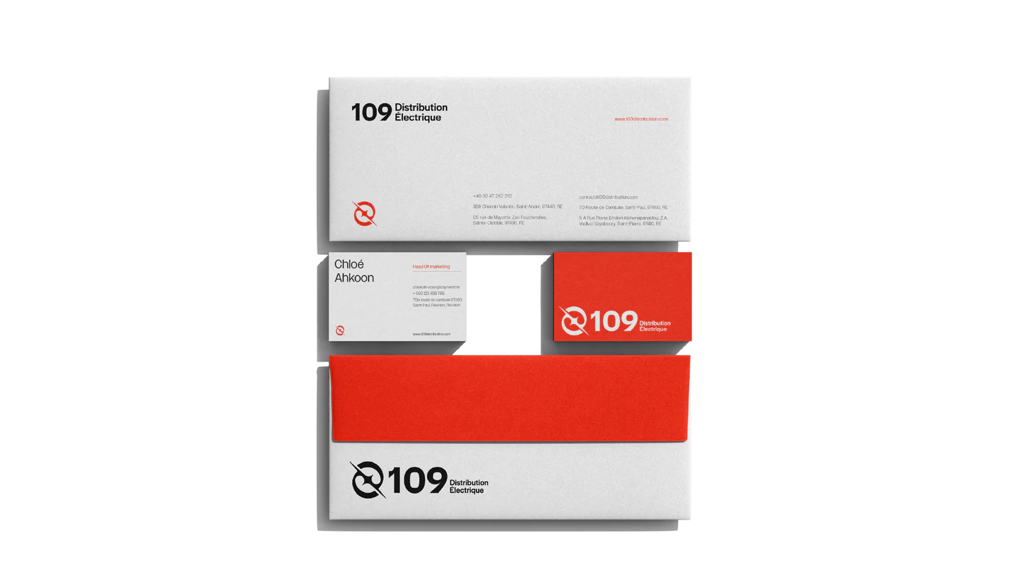
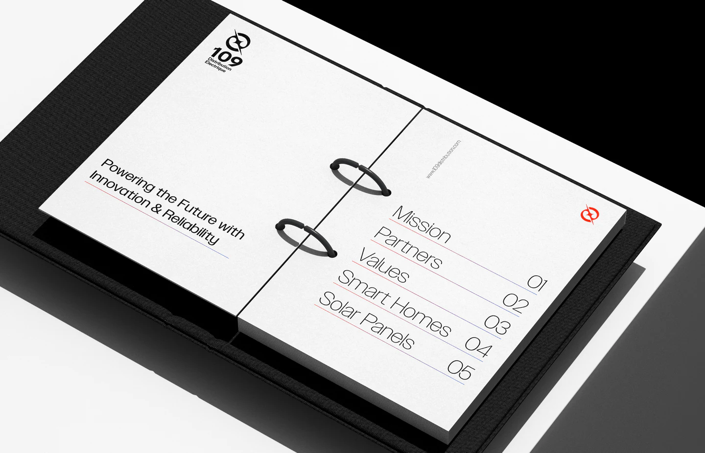
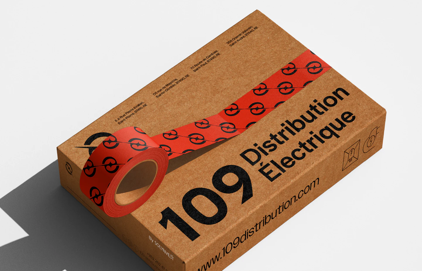
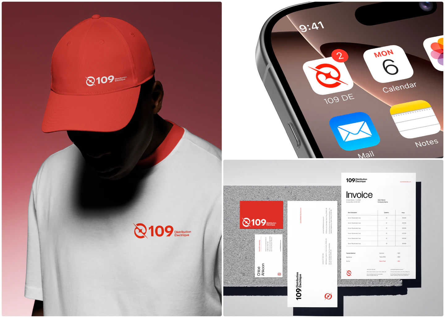
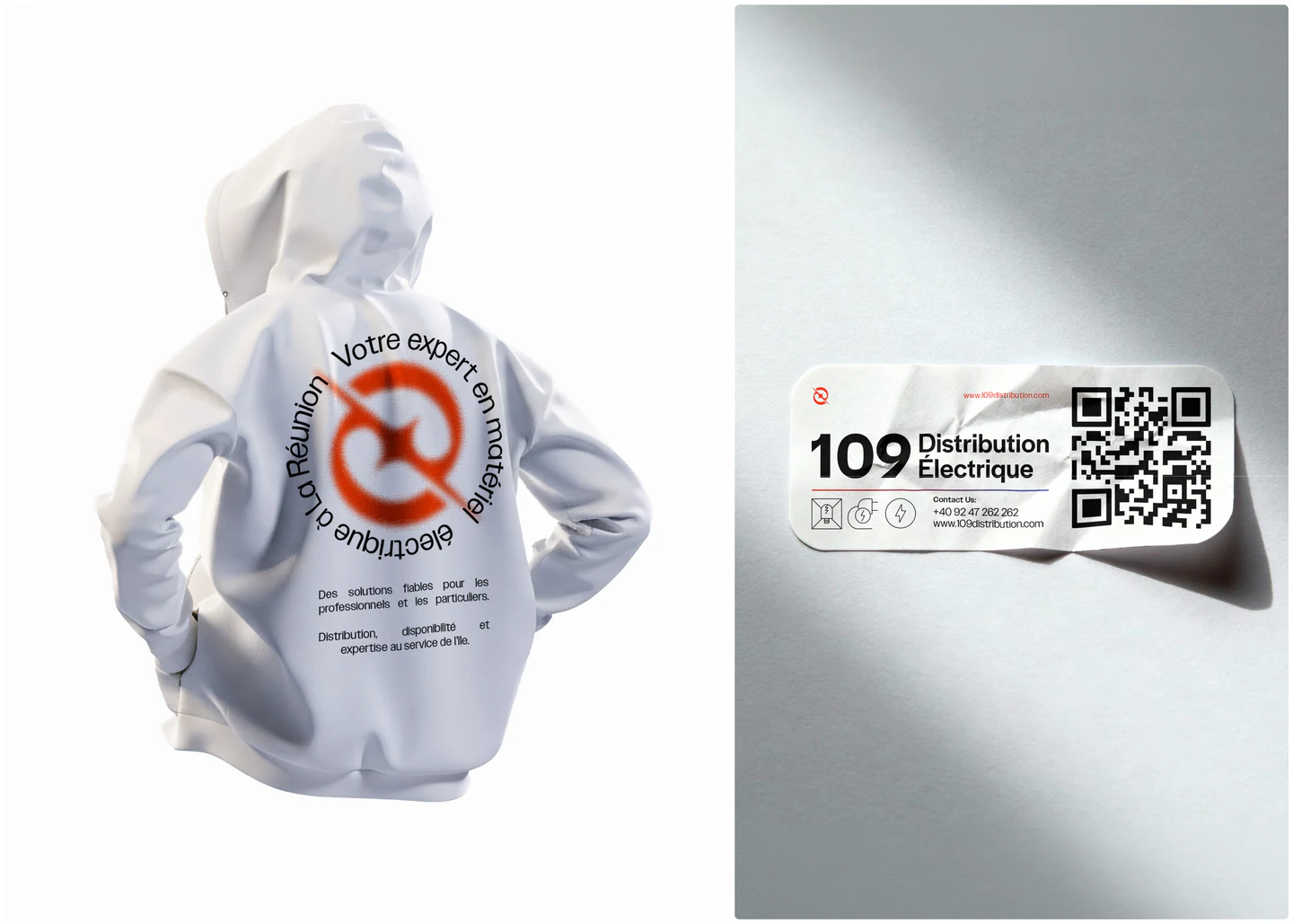
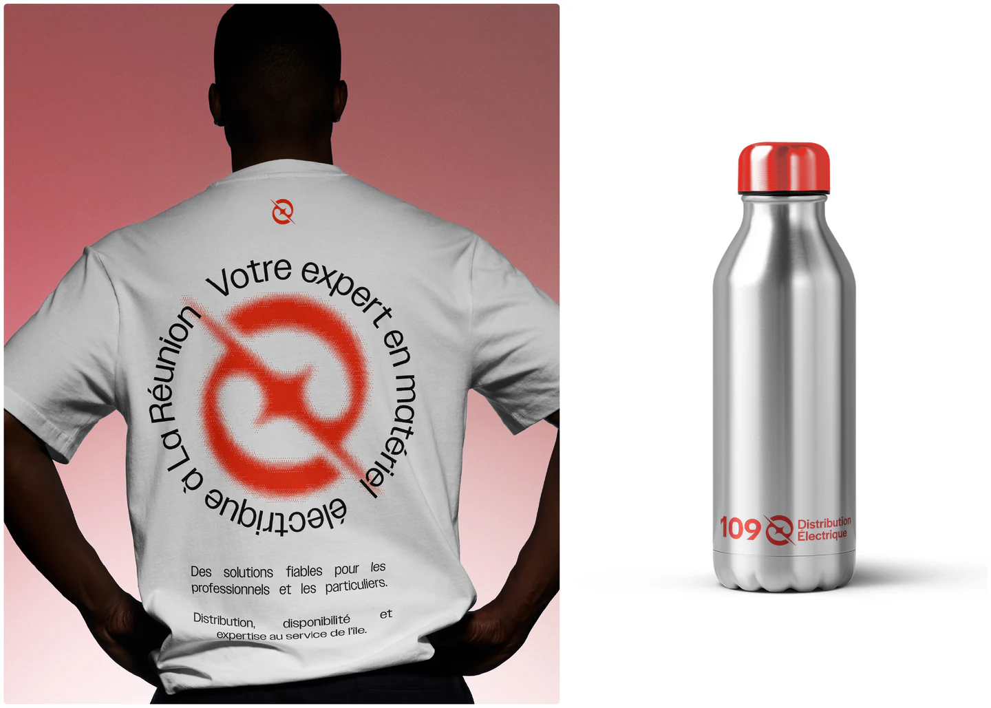
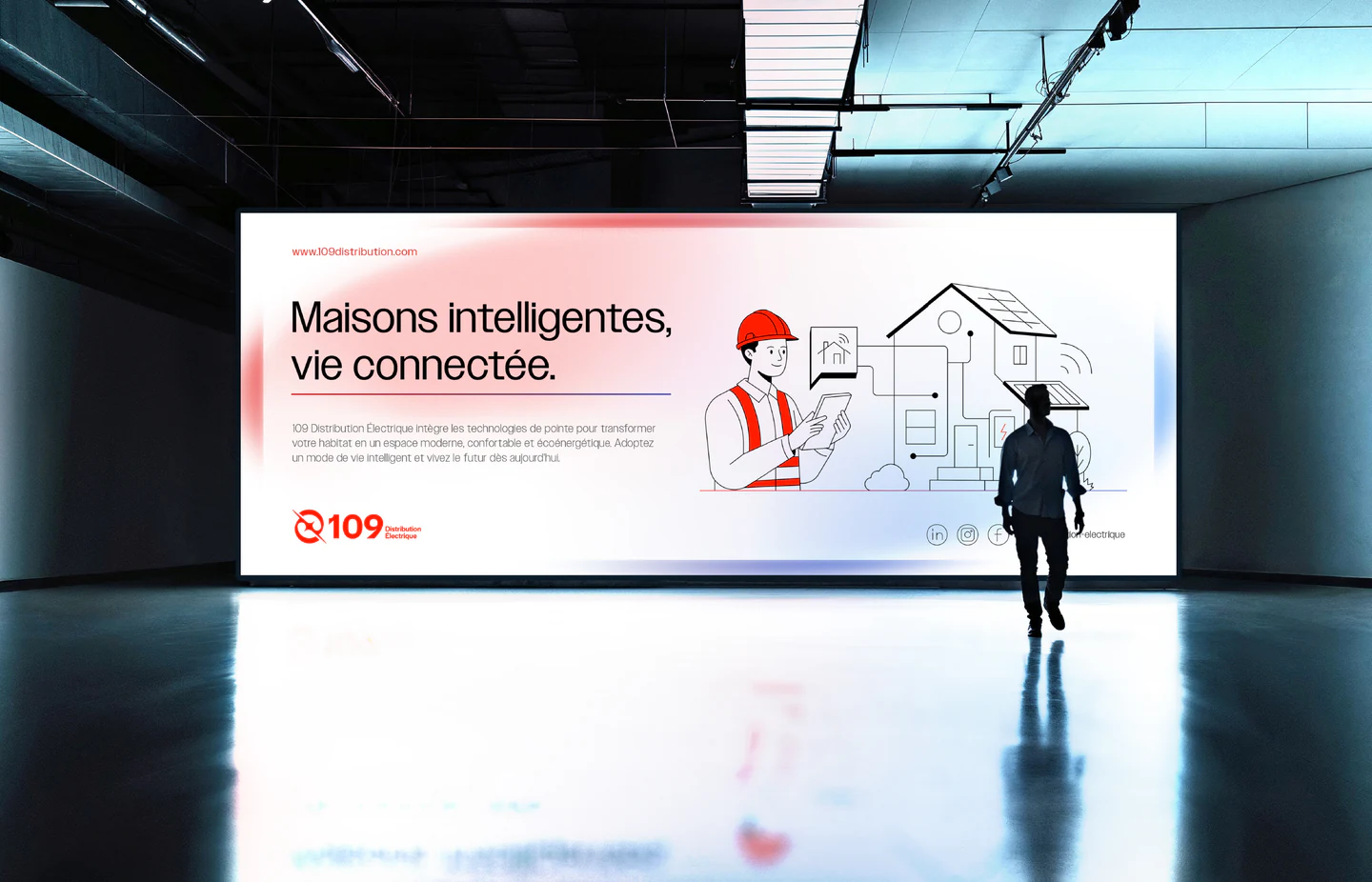
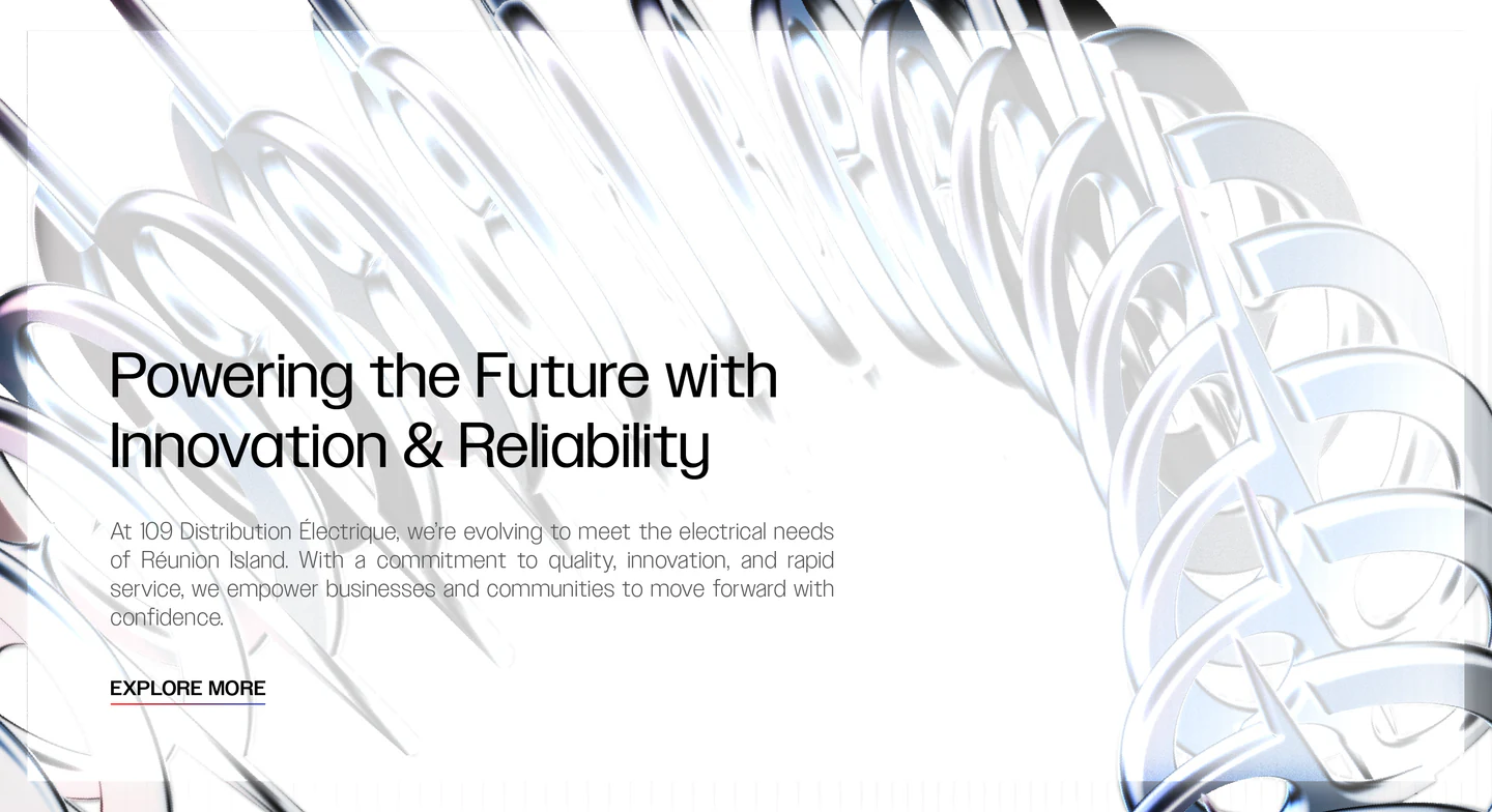
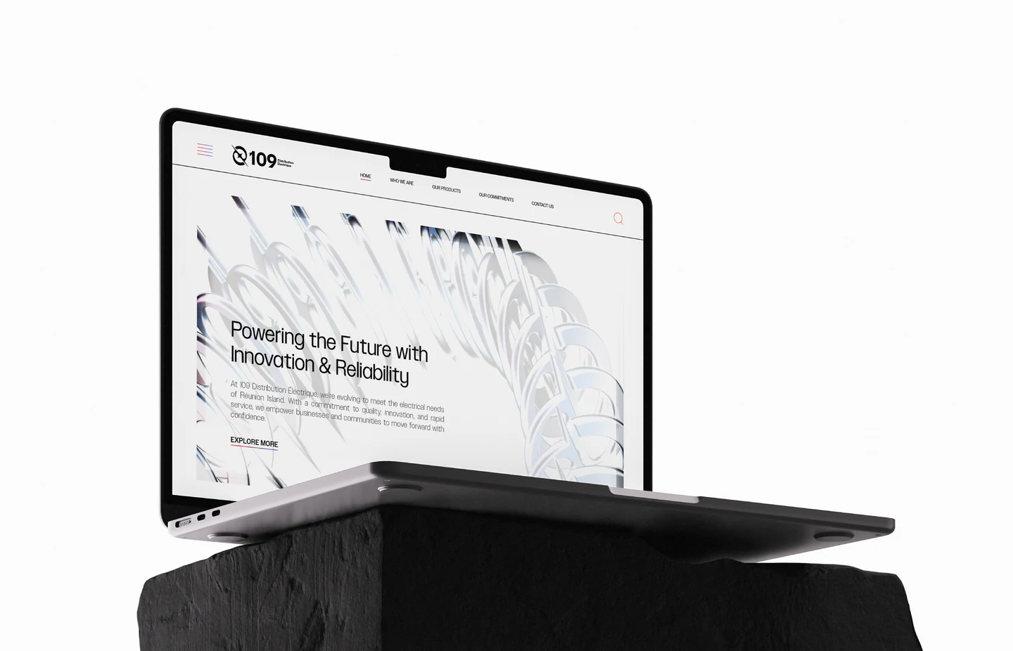
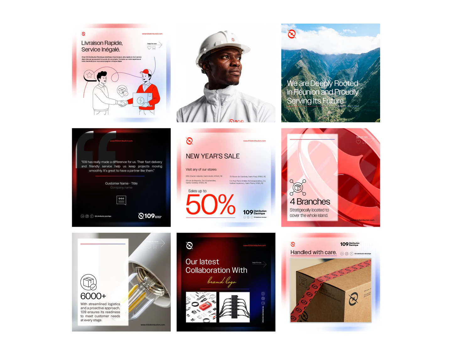
A rebrand built on one Big Idea, Flow Forward, carried by a minimal, clean, industrial aesthetic, a gradient line system, a new logomark, a refined signature red, and a complete iconography system.

© The Big Idea(WDX® — 02)Strategy
©

Continuous movement: an ever-evolving force that drives progress, innovation and reliability.

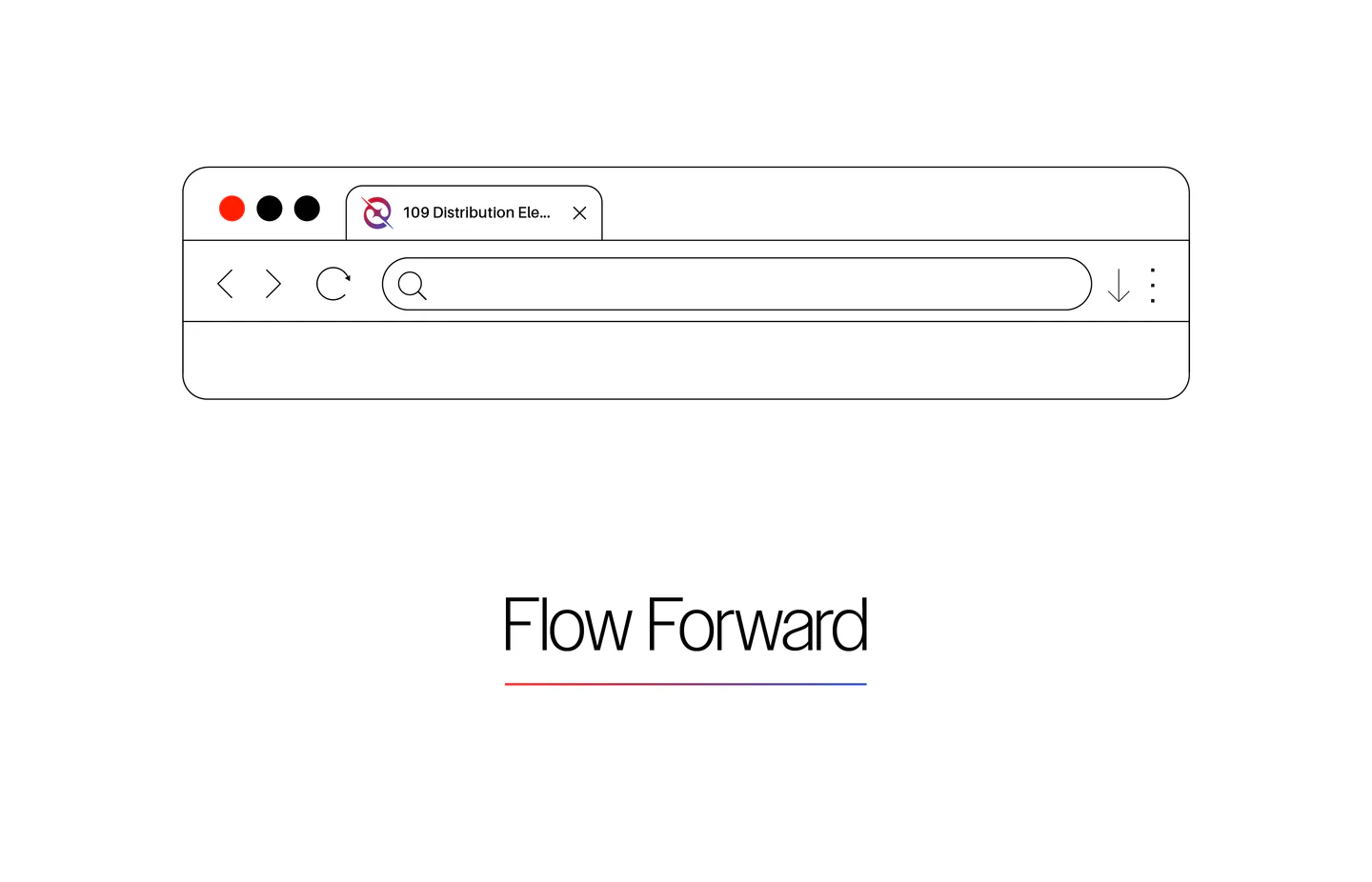
Flow Forward.

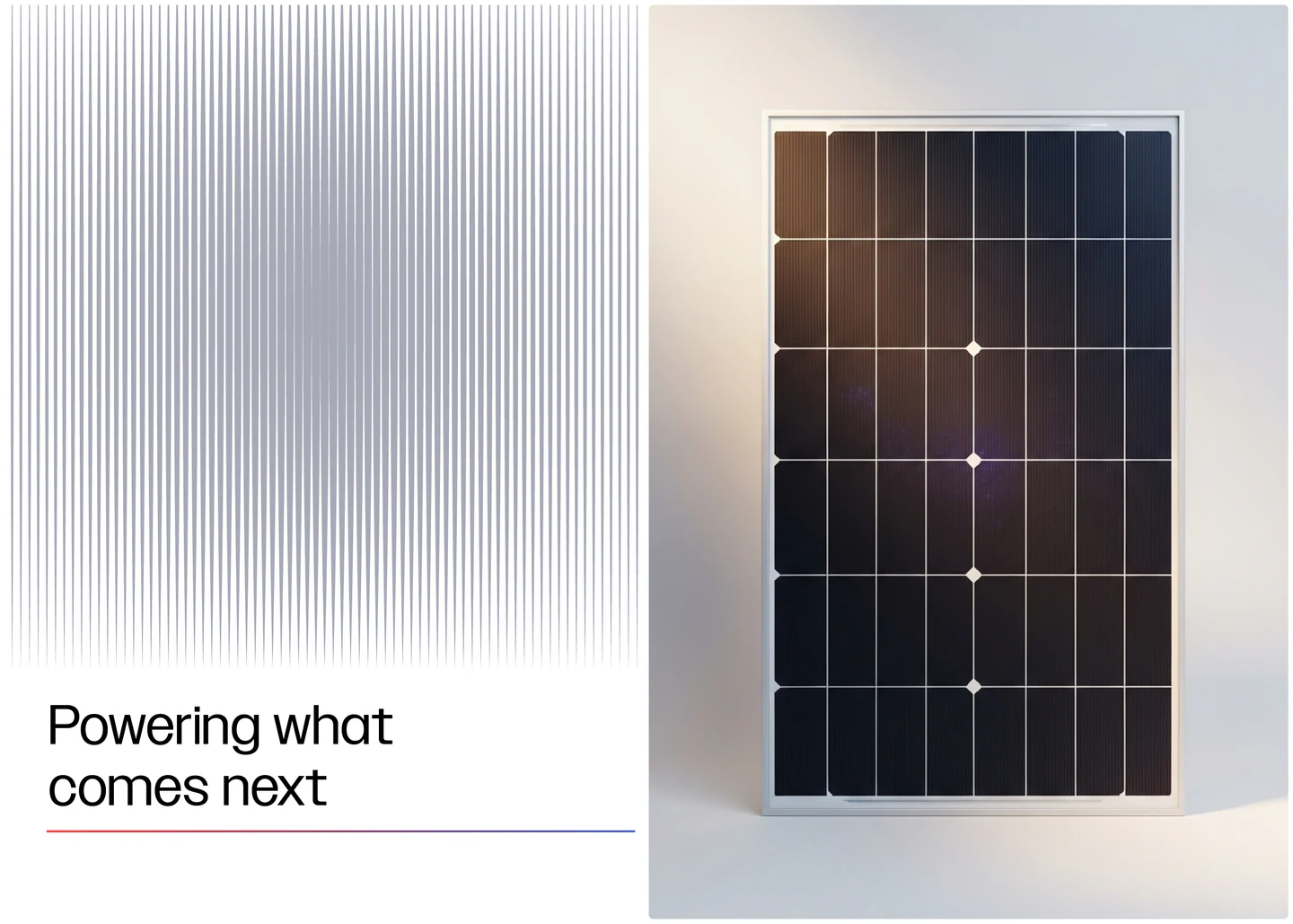
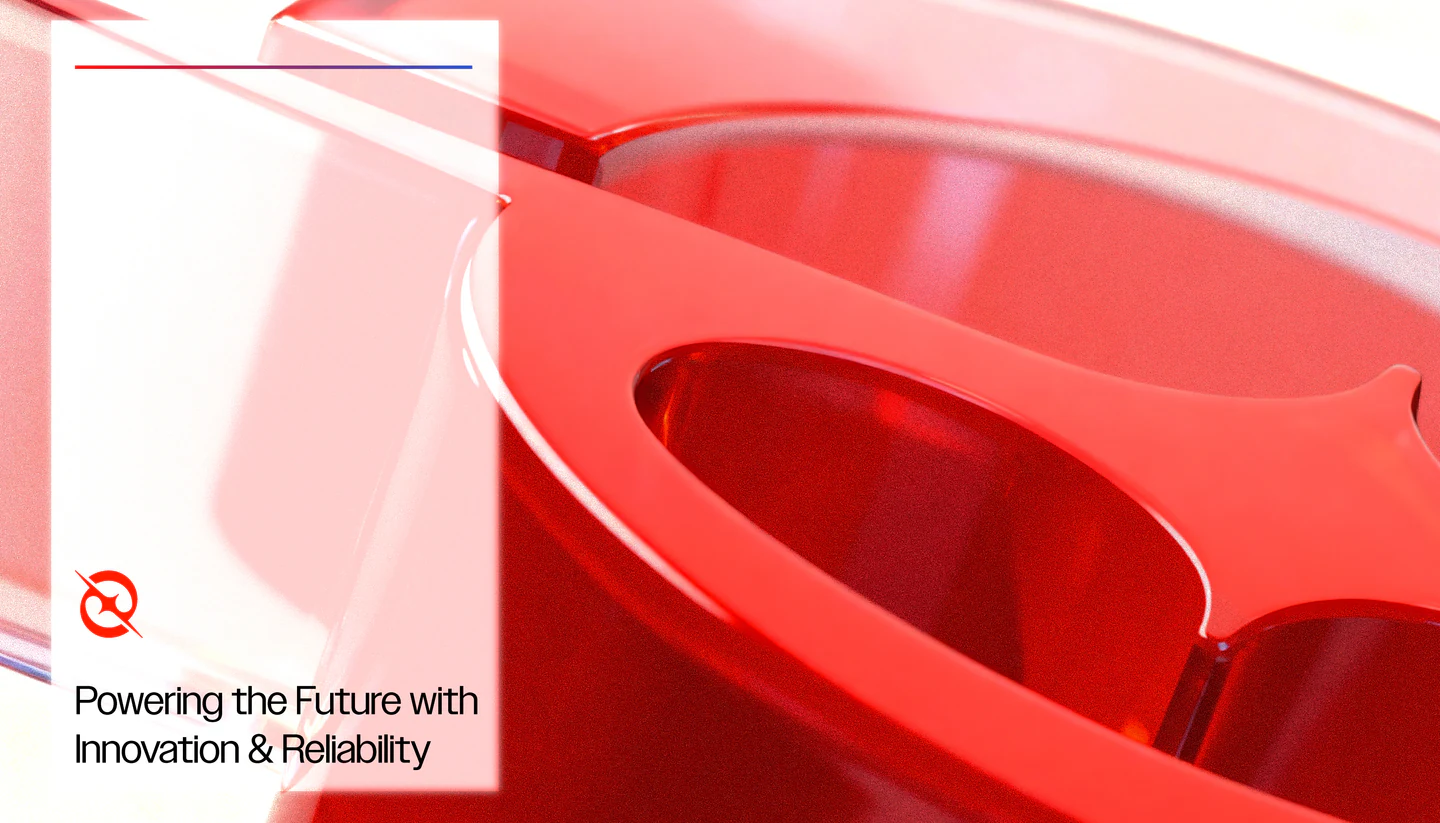
  • [01]The Line“Flow” as a gradient line system: the primary graphic asset that carries motion and energy across the identity.
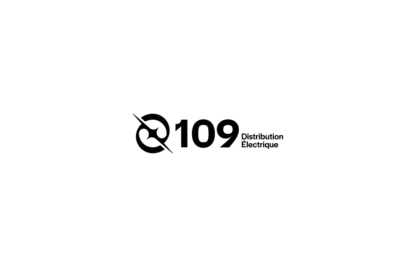
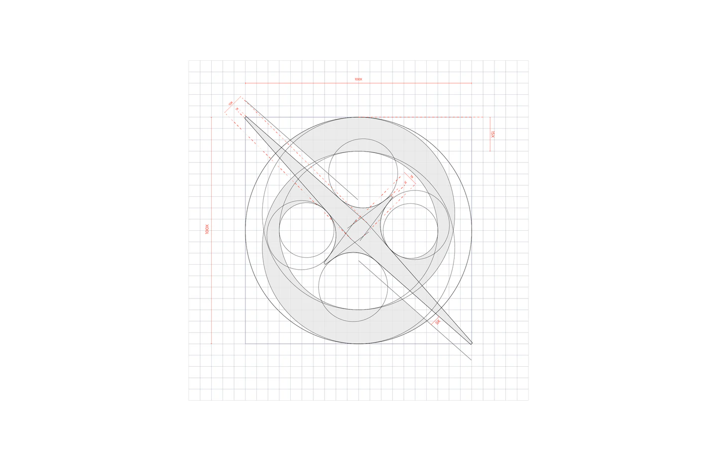
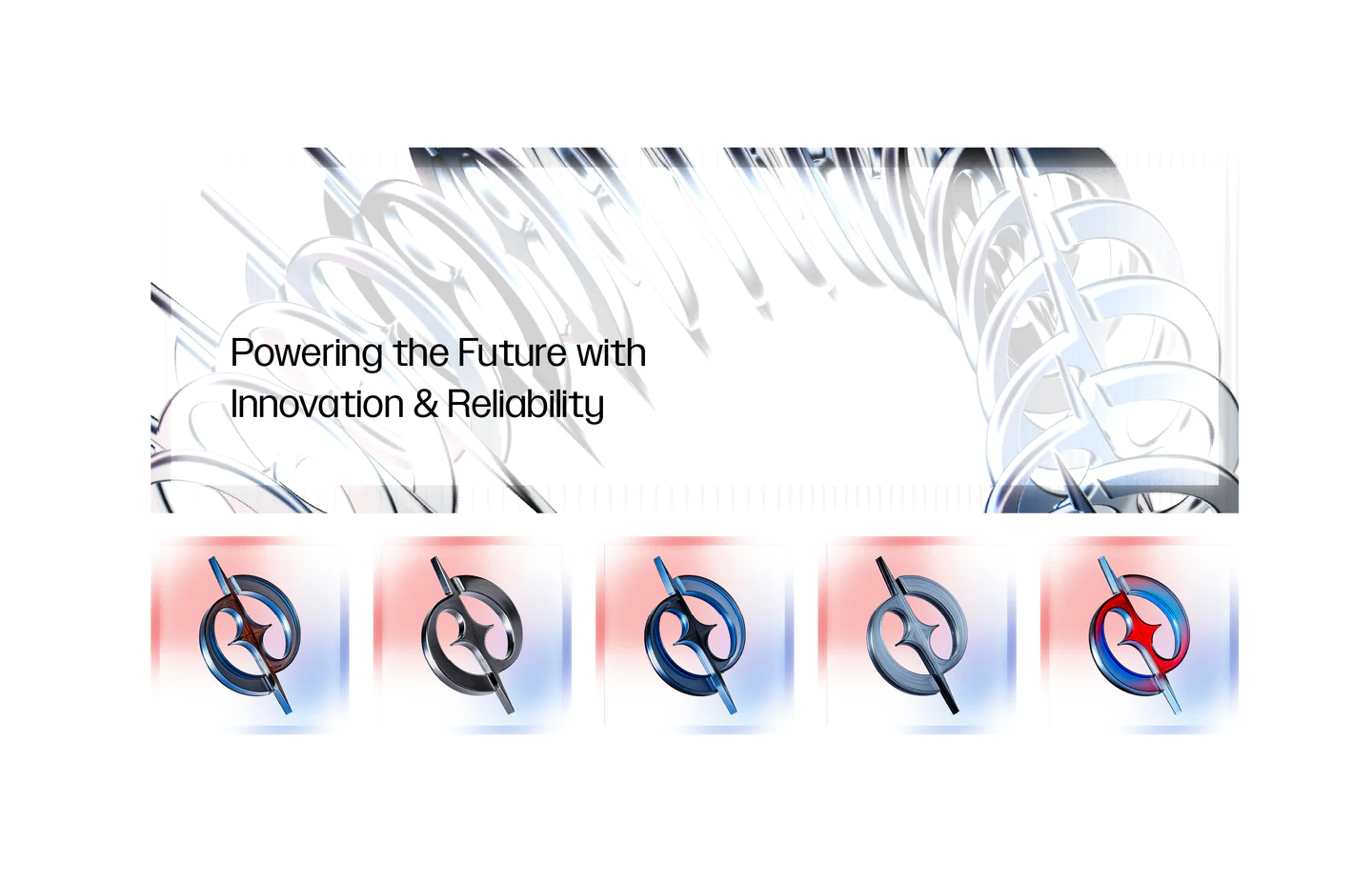
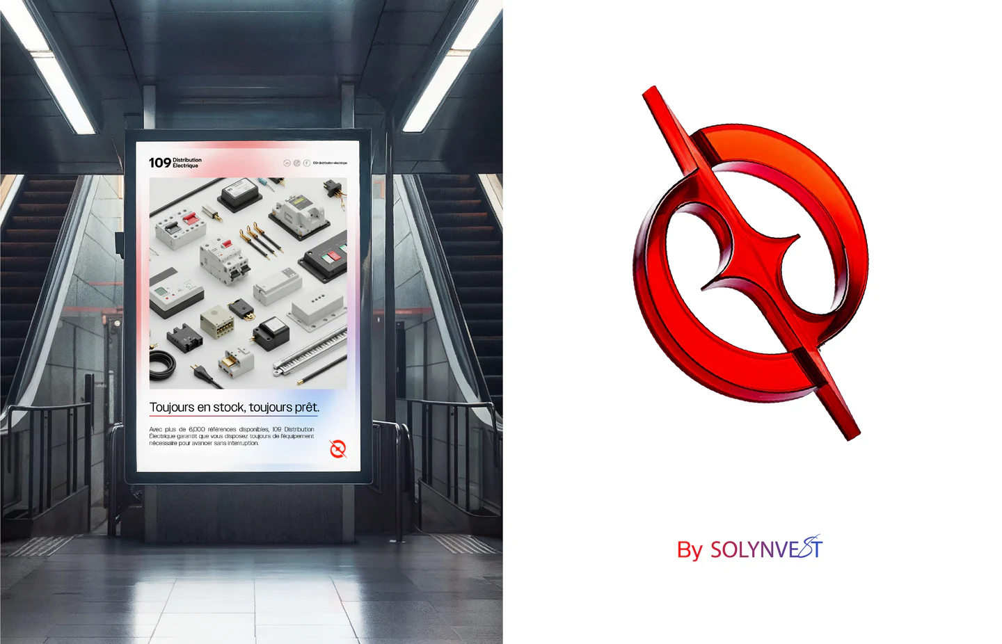
  • [02]The LogomarkInspired by how energy forms: two electrons revolving and colliding at the center, creating a spark.
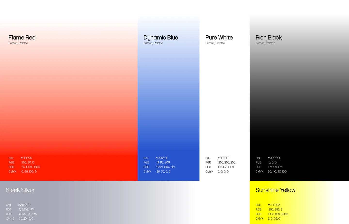
  • [03]The ColourThe signature red, kept and made more vibrant, paired with blue through gradients for movement toward cleaner energy.
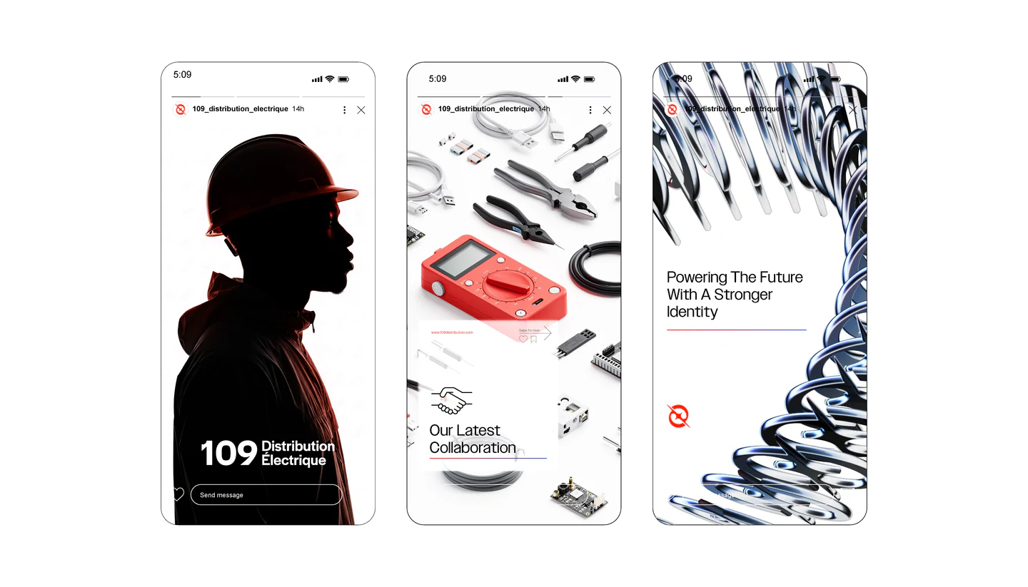
  • [04]The SystemIconography, illustrations, patterns, backgrounds and a photography style, unified across every medium.
  • Clean
  • Minimal
  • Industrial
  • Responsive
  • Direct
  • Dynamic
© The Mark(WDX® — 03)Two Electrons

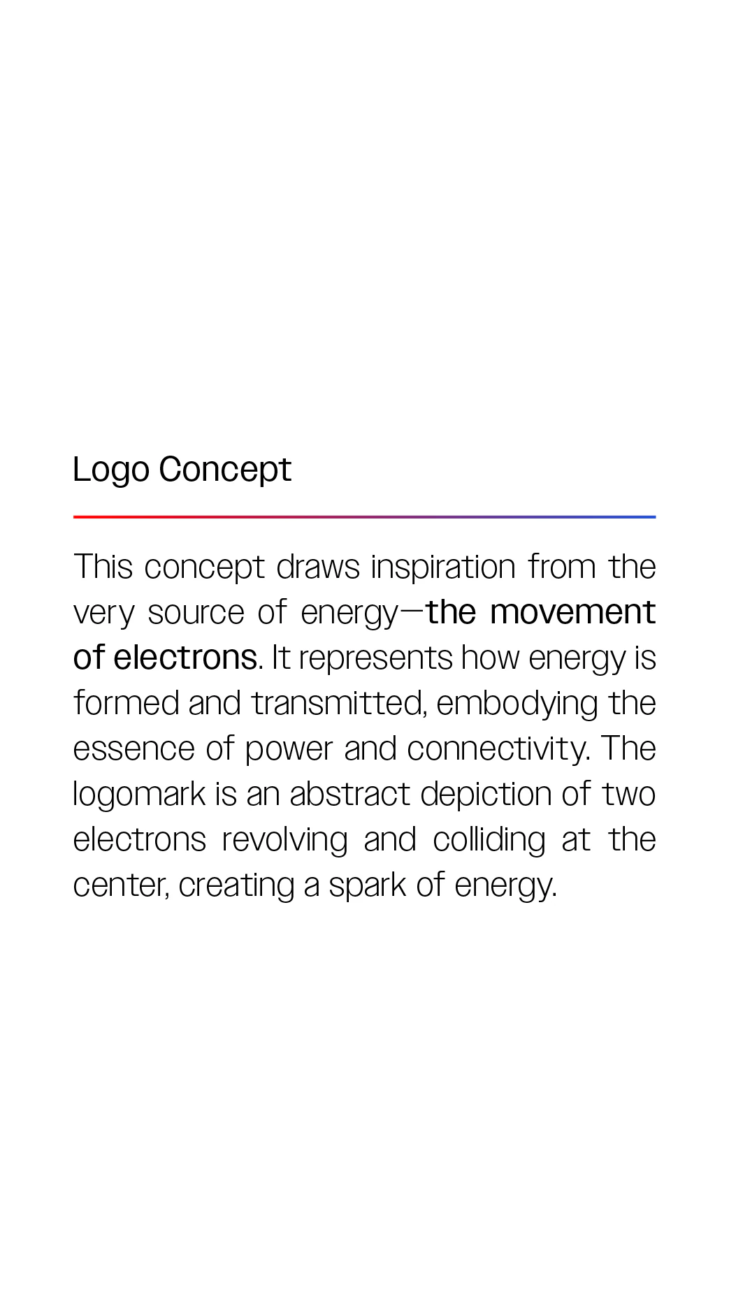
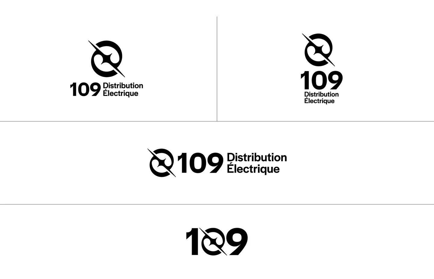
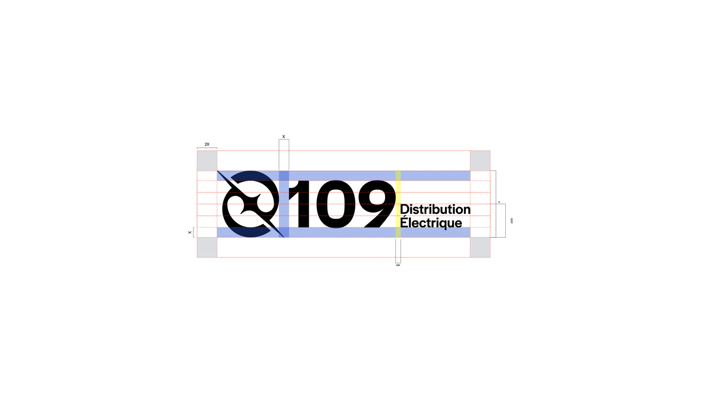

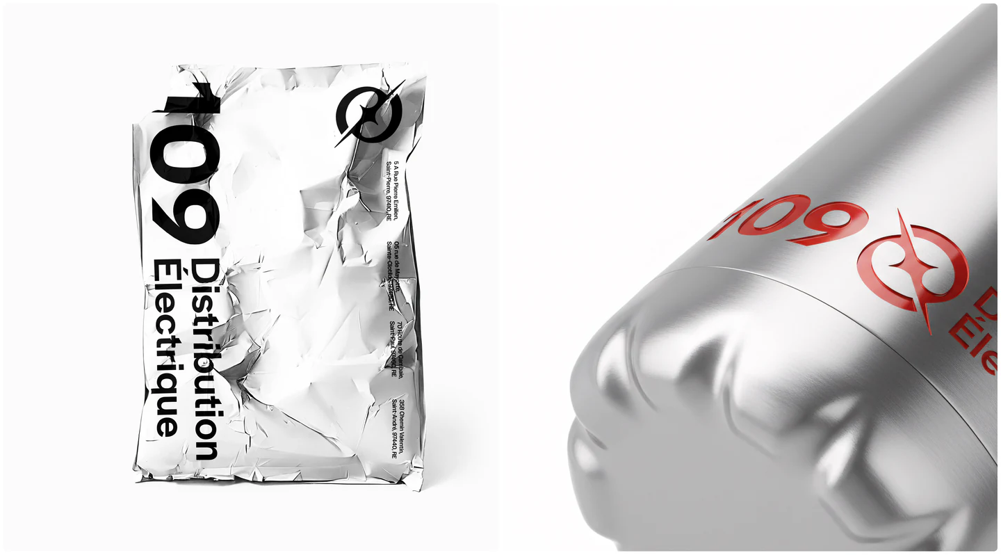
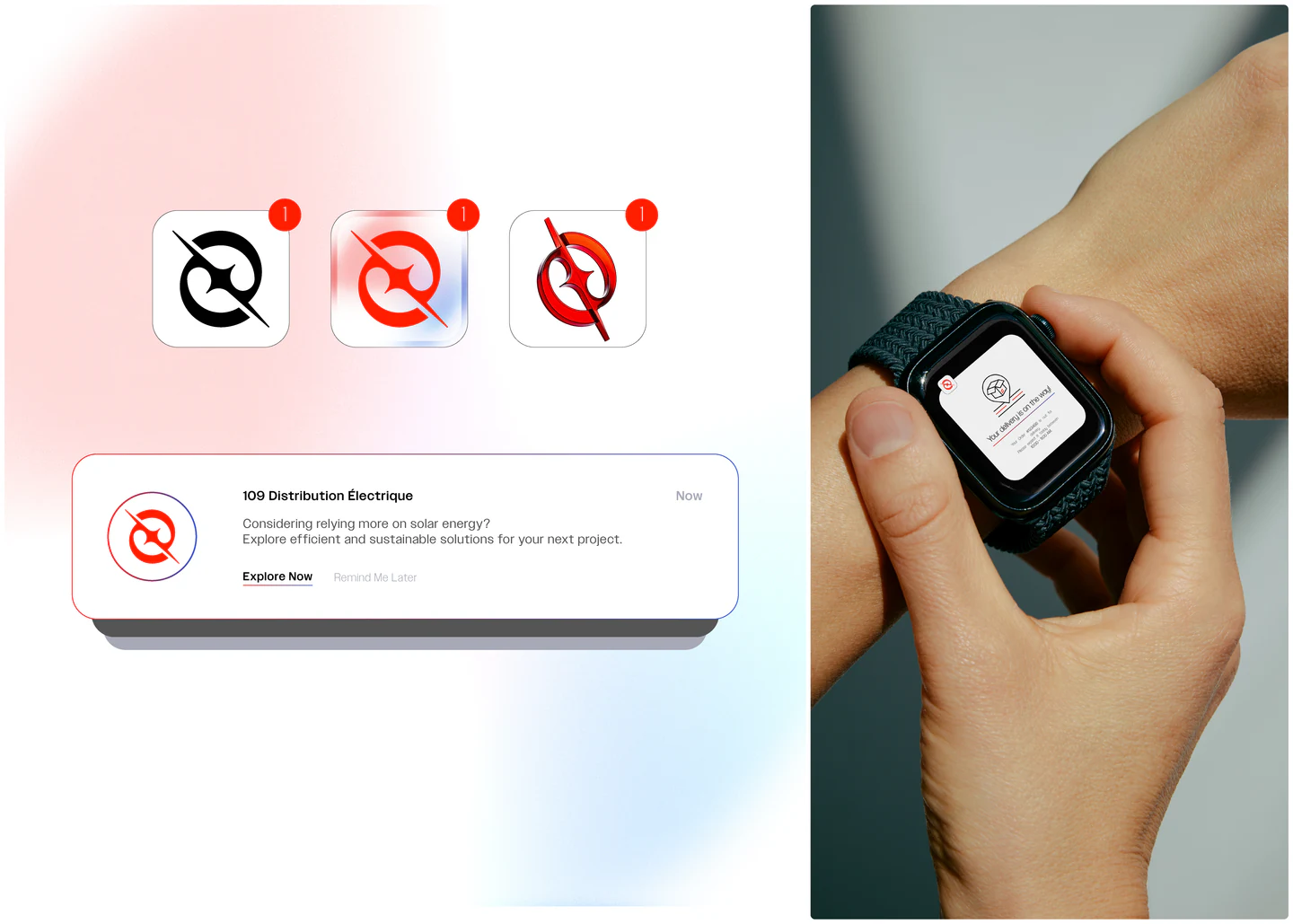
The concept draws on the very source of energy: the movement of electrons. The logomark is an abstract depiction of two electrons revolving and colliding at the center, creating a spark of energy, paired with a refined logotype that works both within the system and on its own.

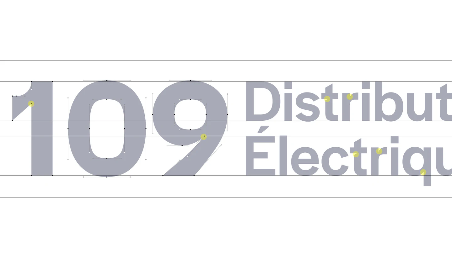
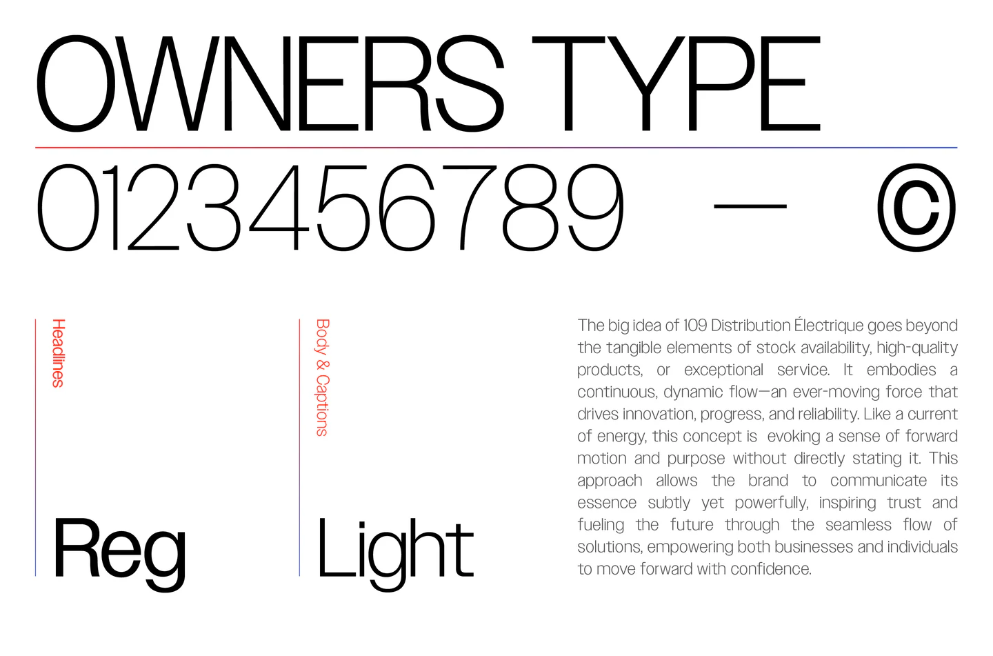
© Palette & Type(WDX® — 04)Set in Owners
© Iconography(WDX® — 05)System


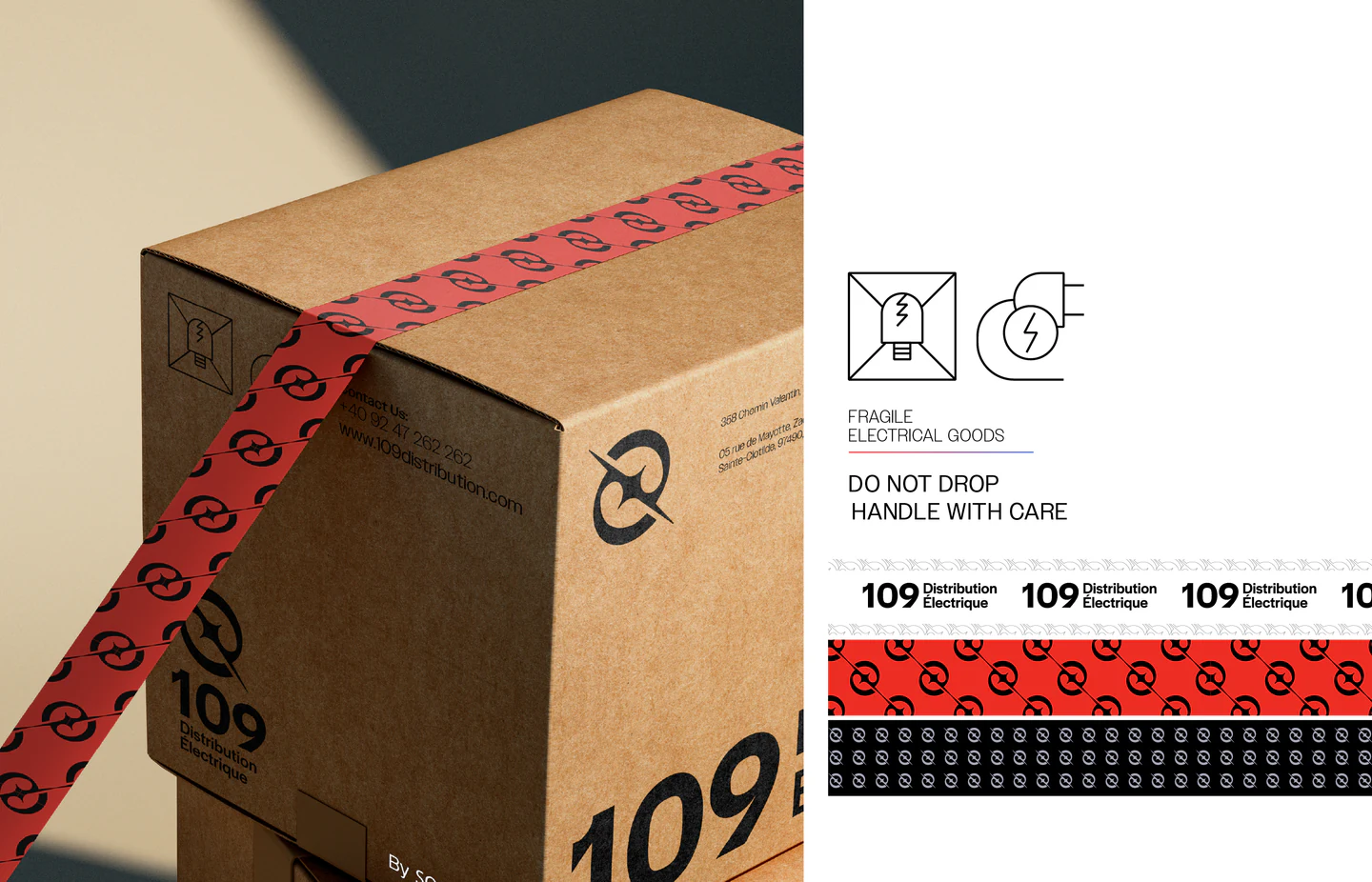
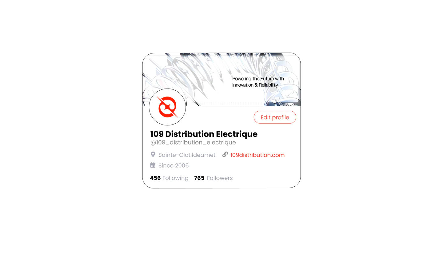
A comprehensive icon system, crafted to cover every aspect of the brand, from social media and advertising to the website and interior environments.
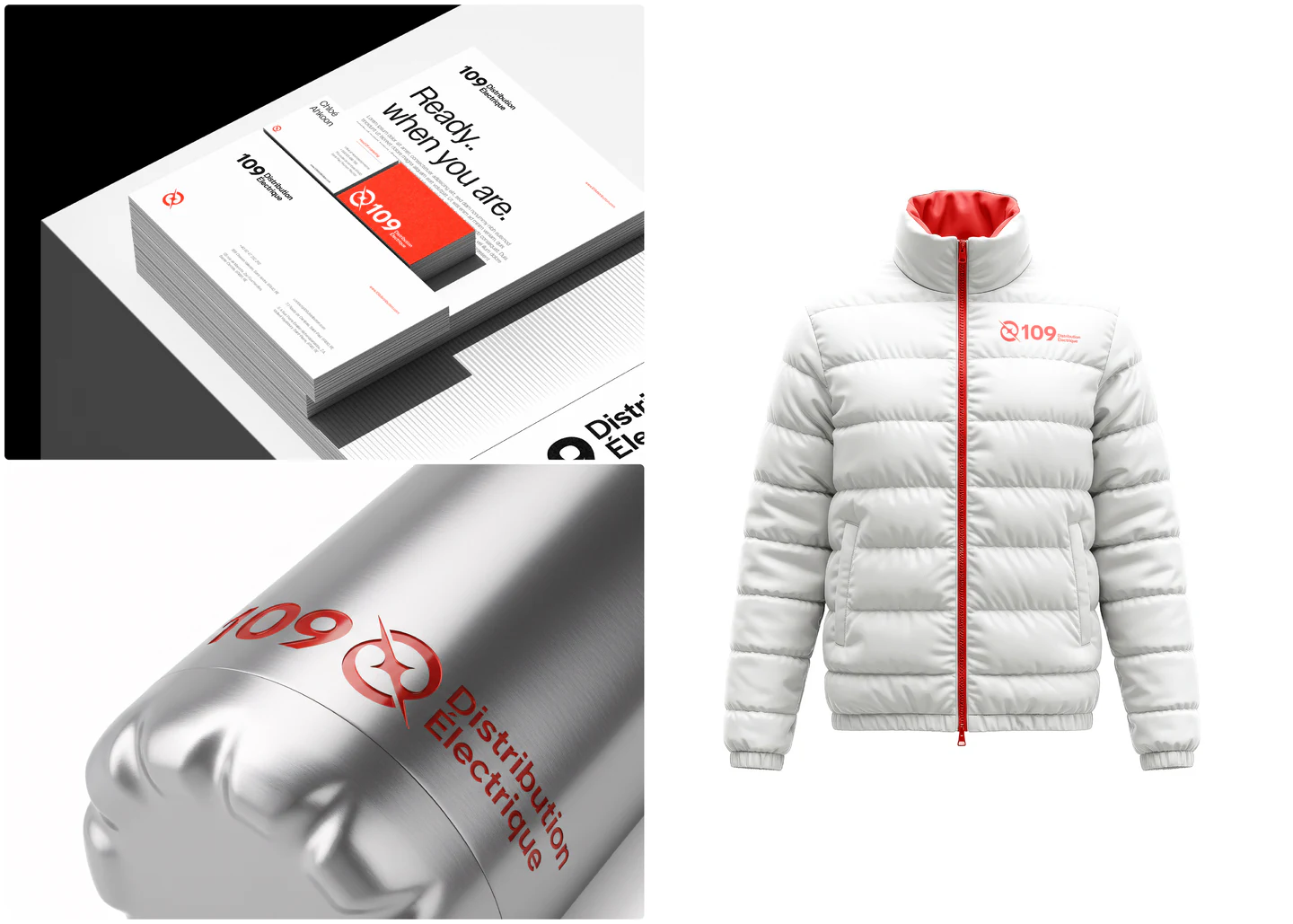
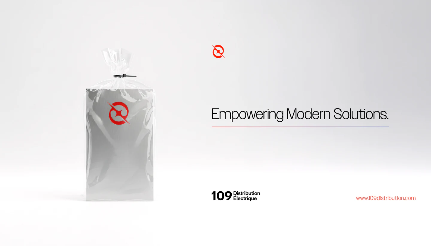
© Print & Packaging(WDX® — 06)Supply
© Uniform(WDX® — 07)On Site
© Spaces & Digital(WDX® — 08)Across the Island
(WDX® — 10) Next project Monra™ →
© Get in Touch(WDX® — 11)Say Hello

Ready to move your brand forward?